Welcome!
I'm Rebecca Comas, a designer based in St. Louis, Missouri. I believe in using design to make every experience inspiring. Please, make yourself at home. Browse my work, get to know me, and introduce yourself!

Welcome!
I'm Rebecca Comas, a designer based in St. Louis, Missouri. I believe in using design to make every experience inspiring. Please, make yourself at home. Browse my work, get to know me, and introduce yourself!

Welcome!
I'm Rebecca Comas, a designer based in St. Louis, Missouri. I believe in using design to make every experience inspiring. Please, make yourself at home. Browse my work, get to know me, and introduce yourself!
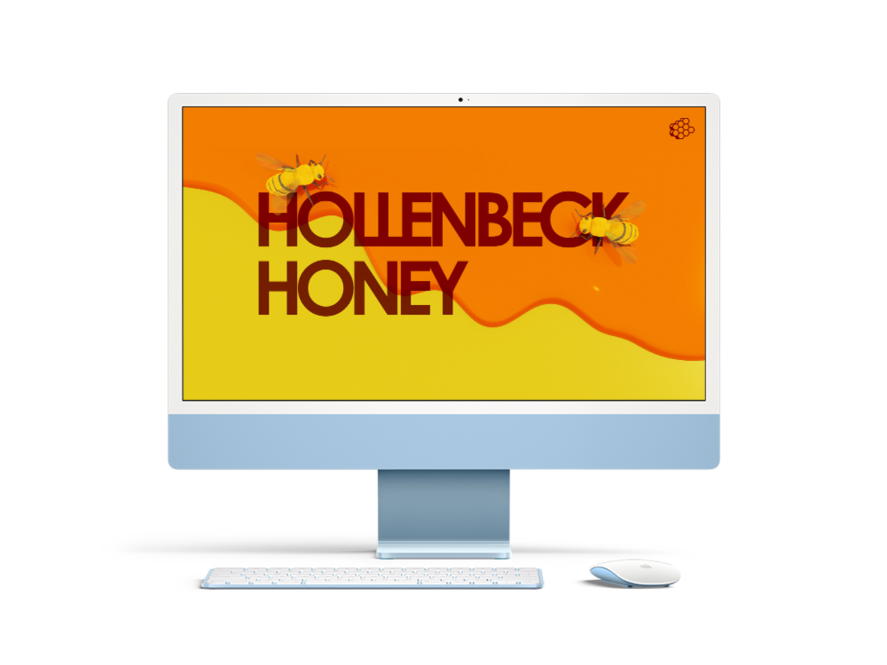
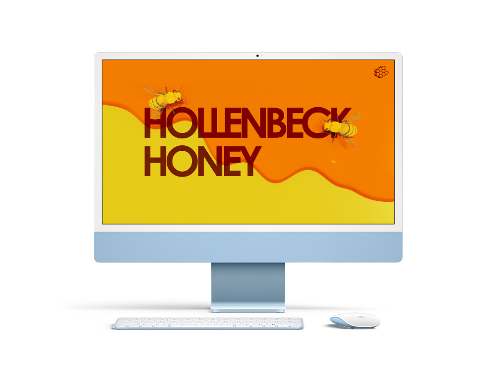
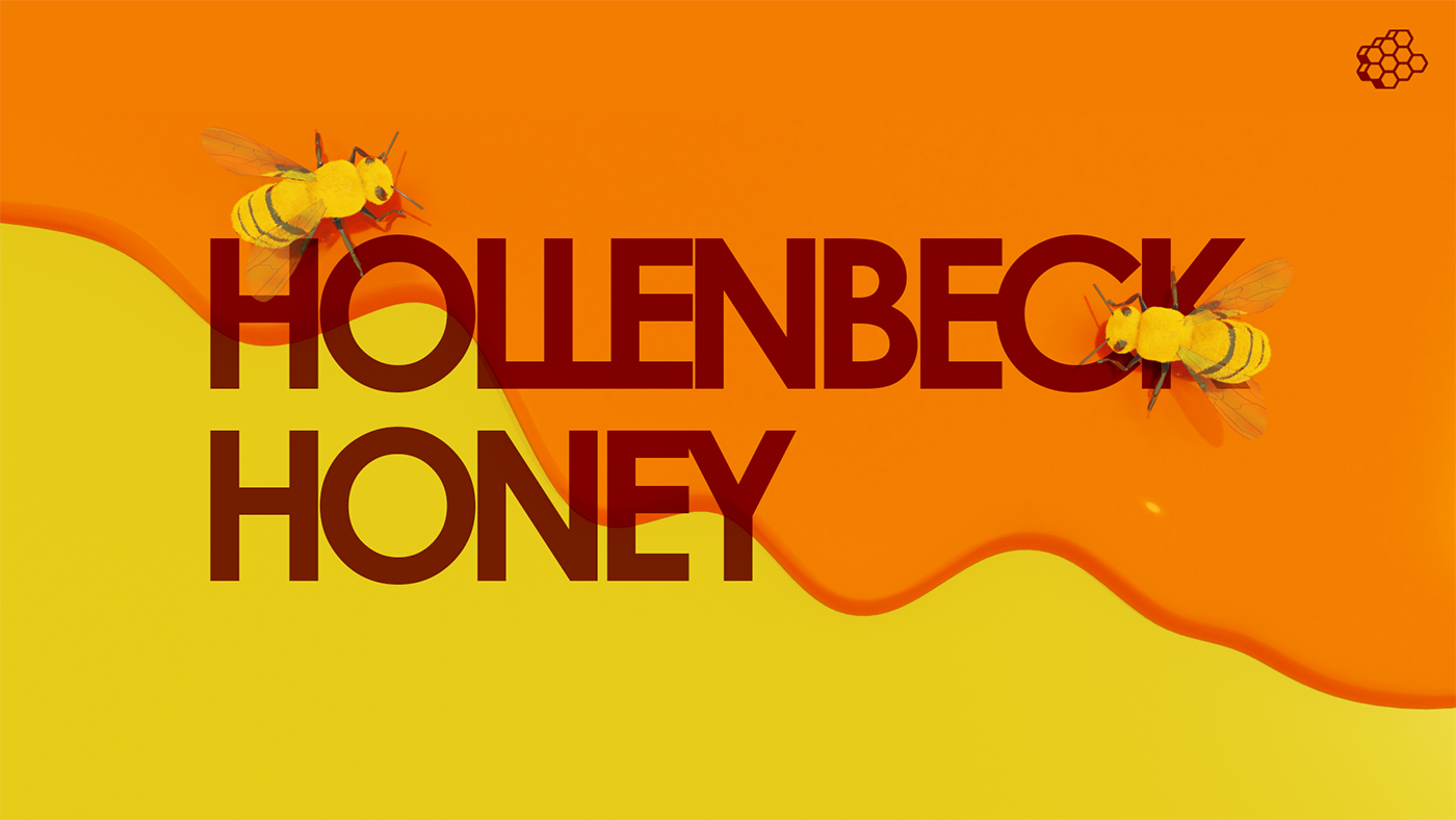
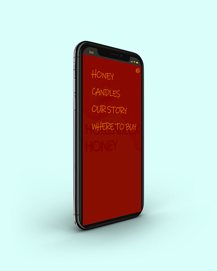
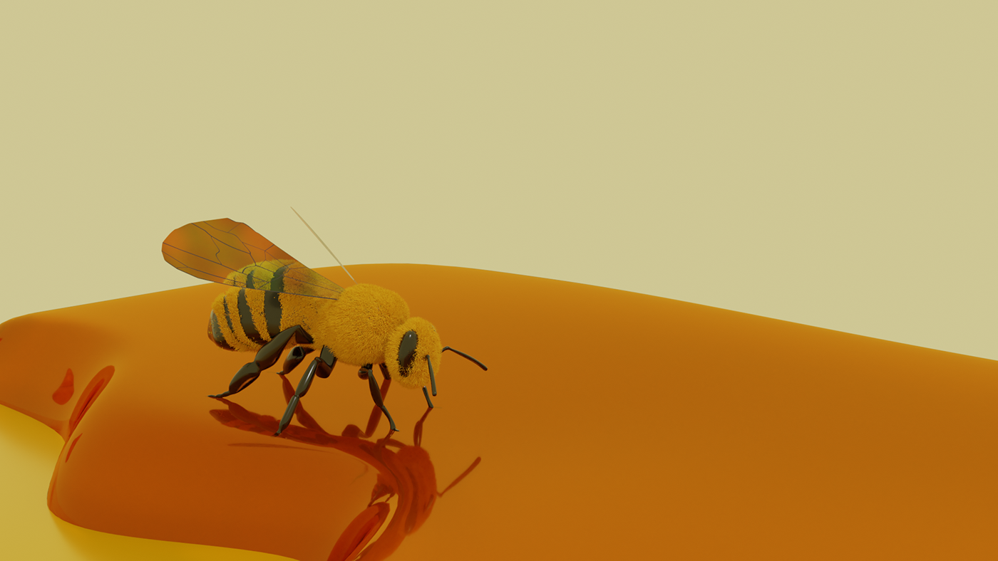
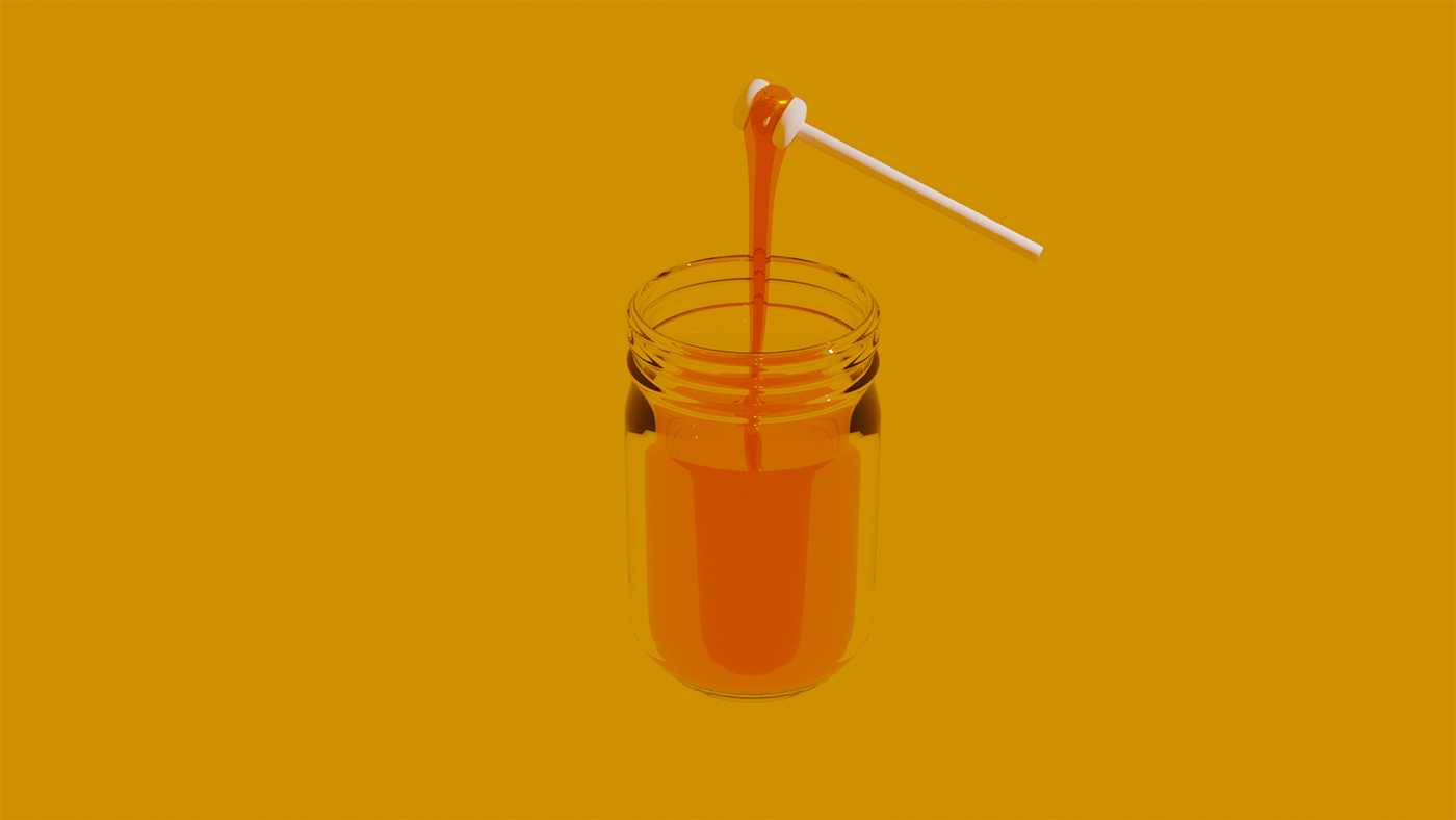
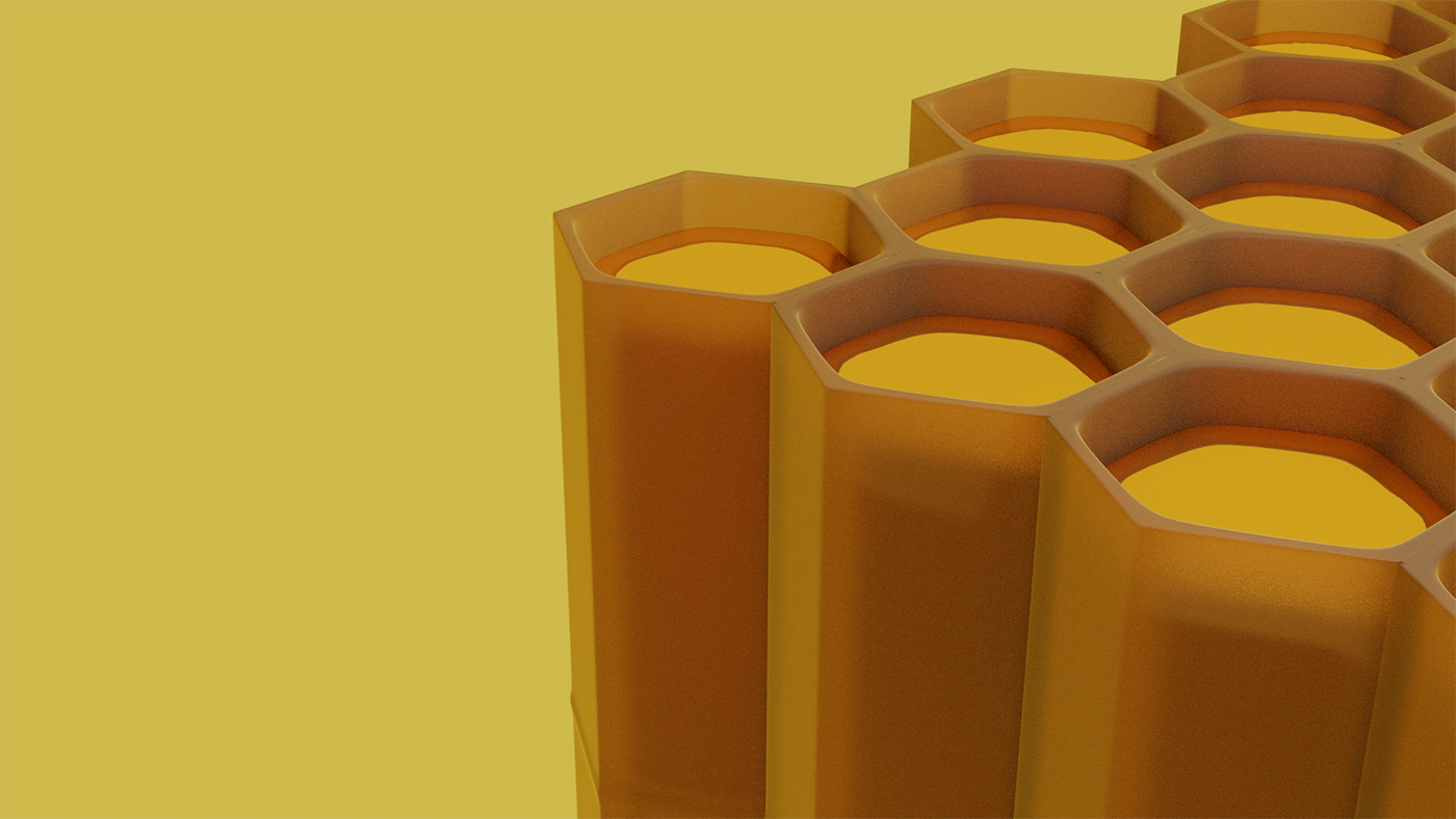
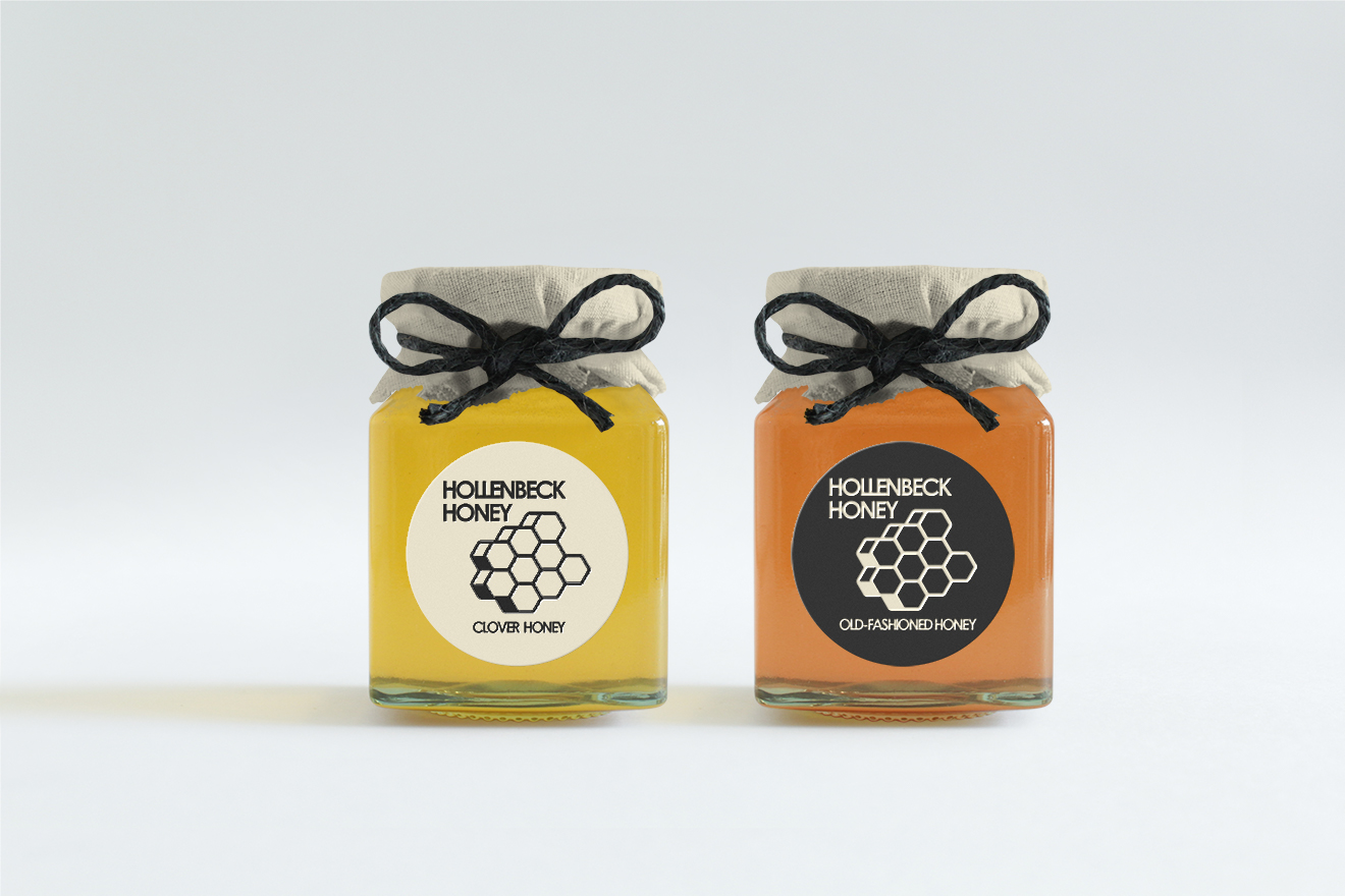
As part of my BFA capstone, I designed a website for Hollenbeck Honey Farm, created 3D graphics and animations for the website, and redesigned their visual identity.
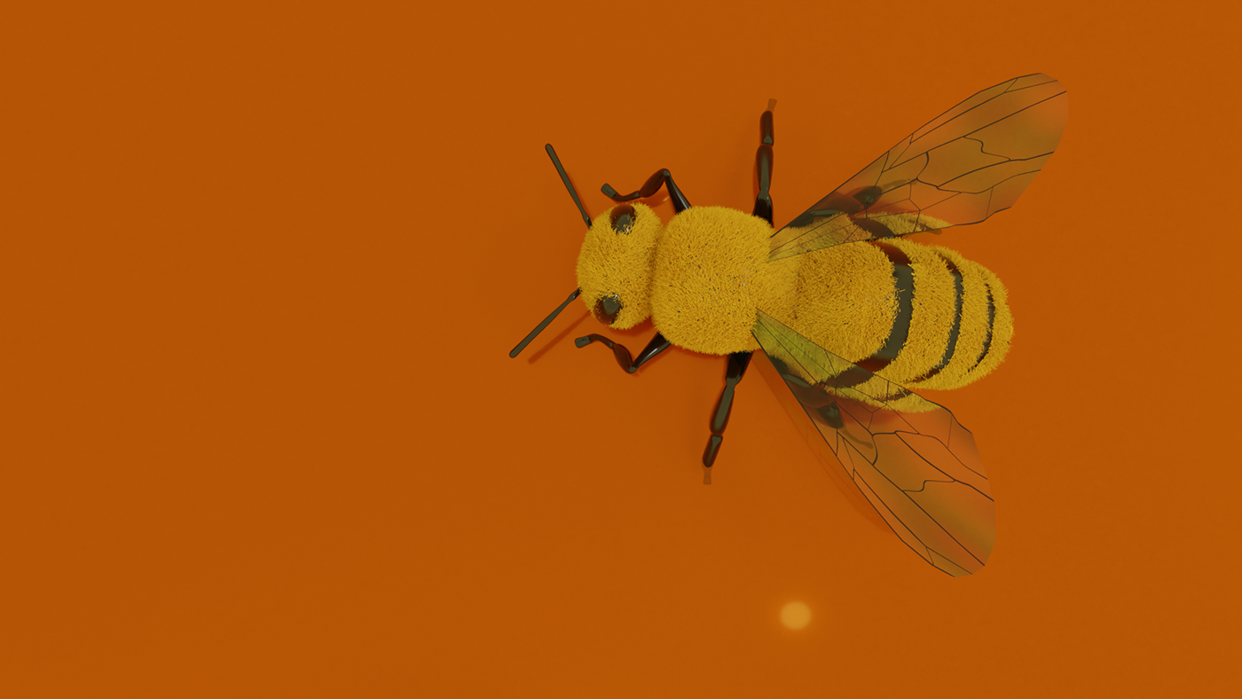
The Hollenbeck Honey website uses 3D graphics to focus on the honey itself and the bees that produced it. On the home page, the user is greeted by a wave of honey that covers the title, and some friendly bees that buzz about the page. Using the navigation in the upper right corner, users can navigate to different parts of the site, including the Products page, where they will see 3D-modeled representations of Hollenbeck Honey’s honey products.
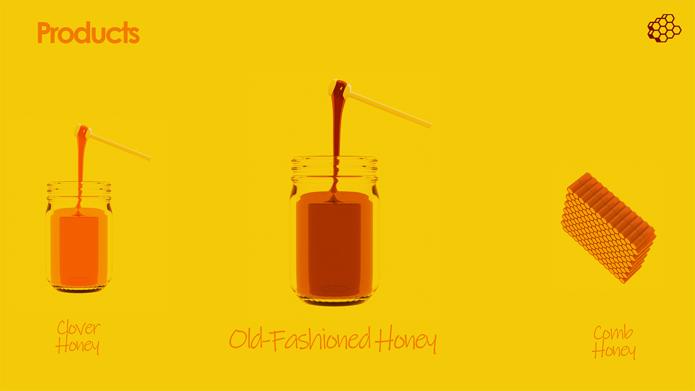
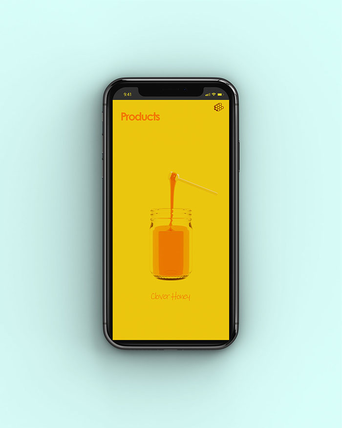
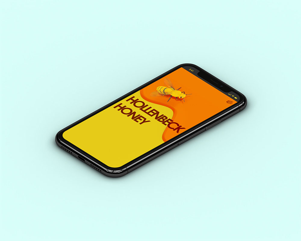
I created several 3D models for this project, including a honeybee model and several product models. I also developed materials for the models.
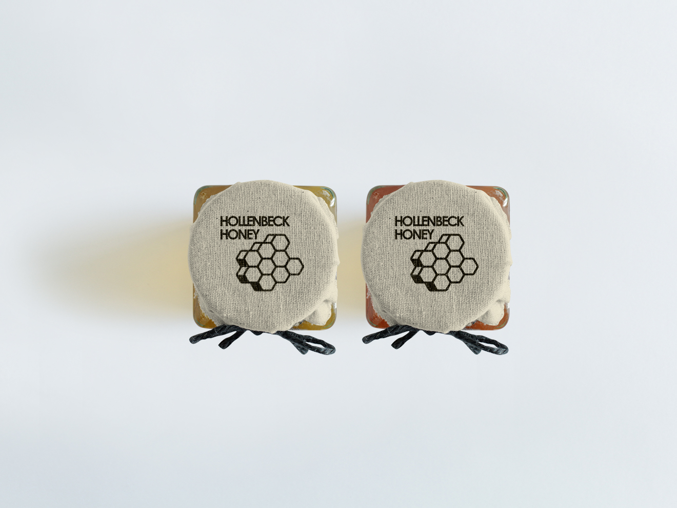
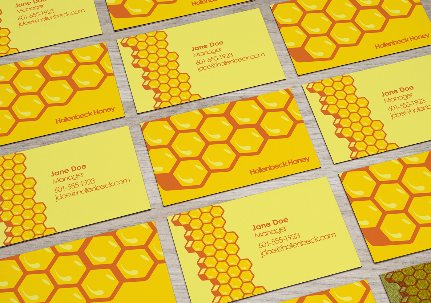
In addition to the website and 3D graphics, I designed product labels and business cards to be used in the physical world by Hollenbeck Honey.


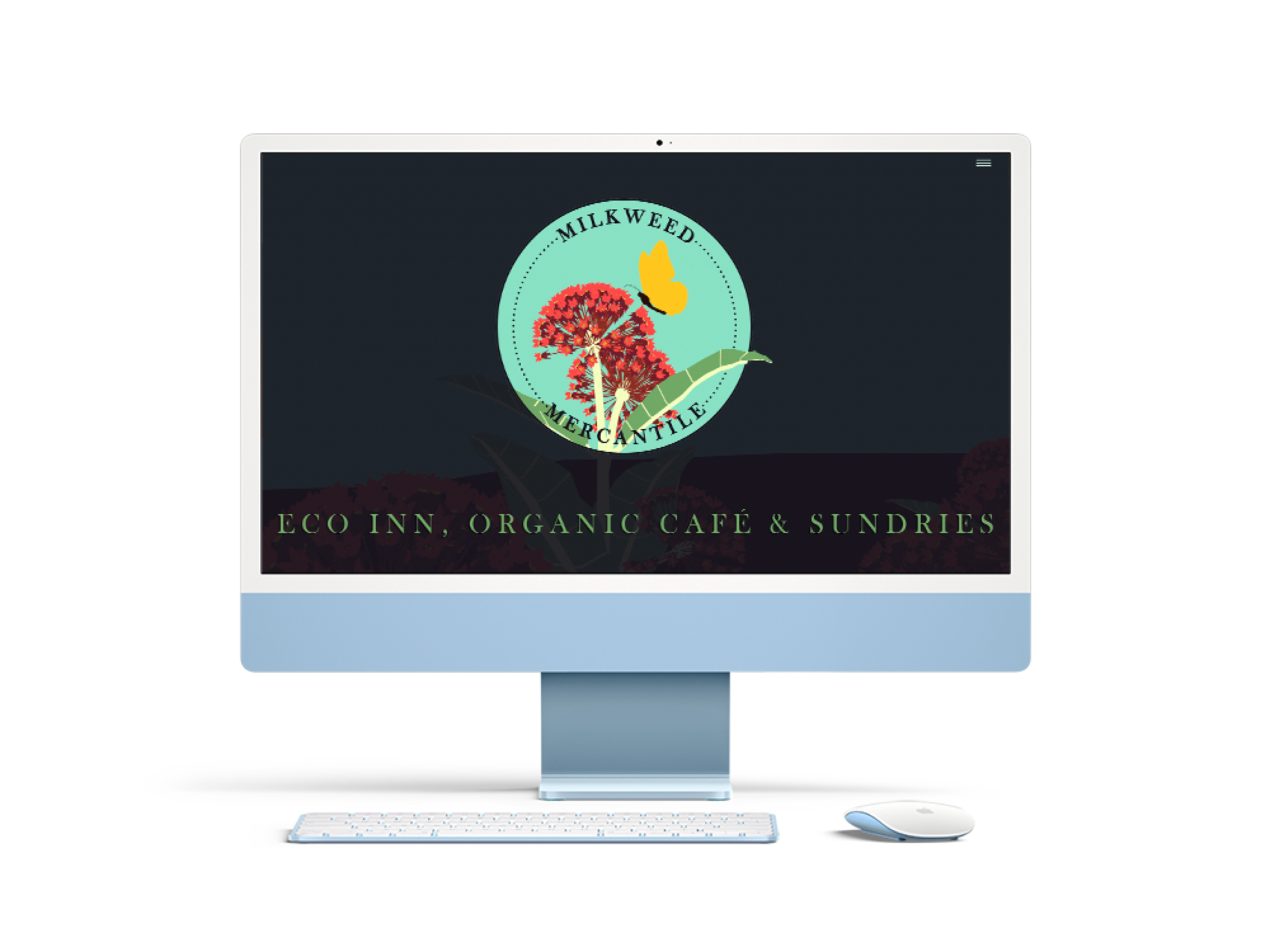
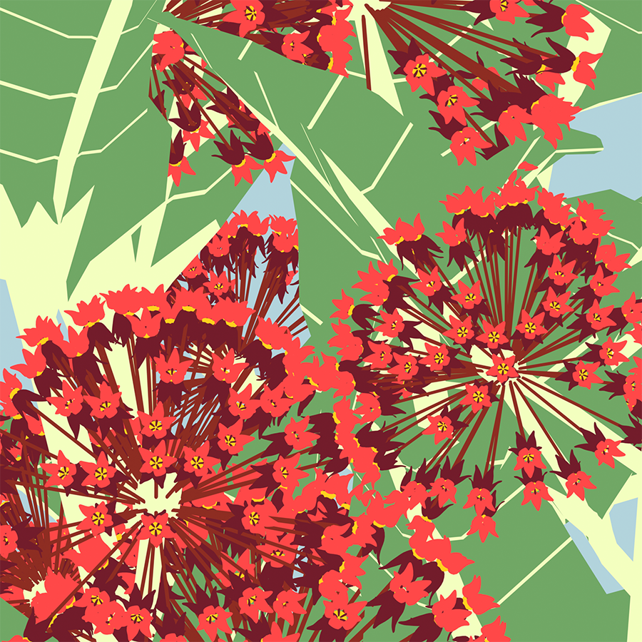
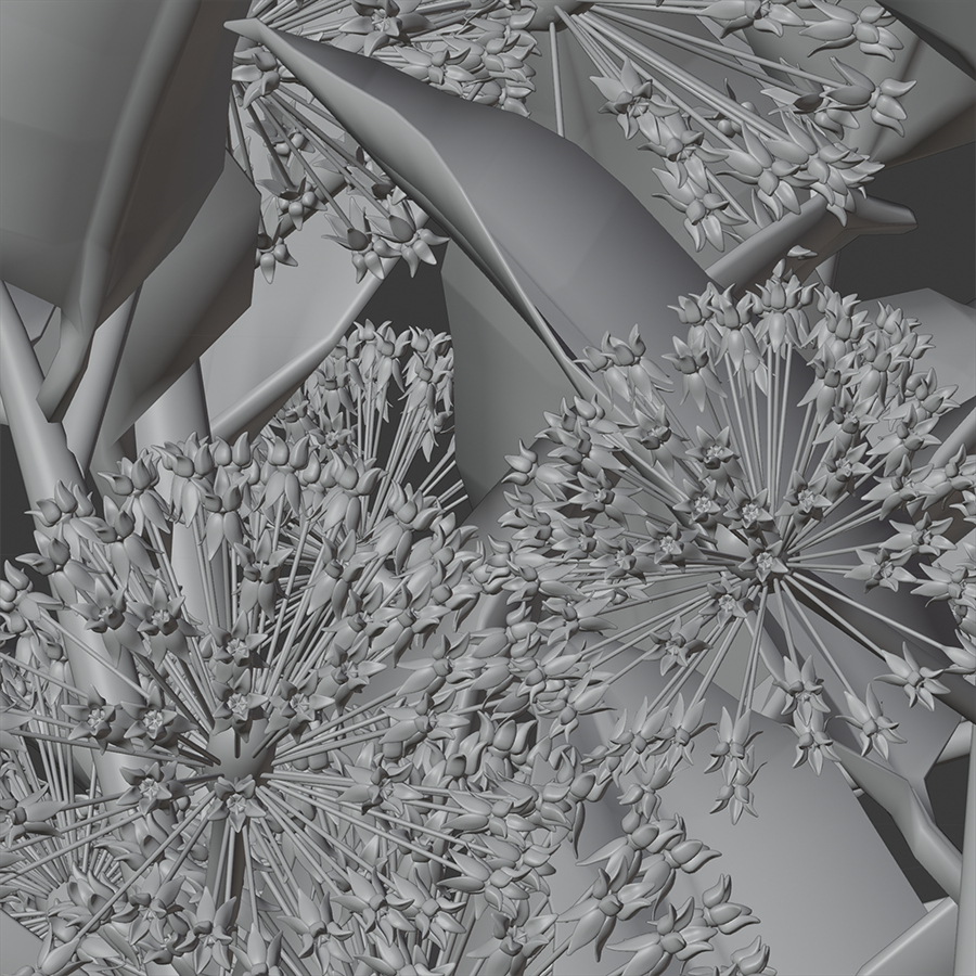
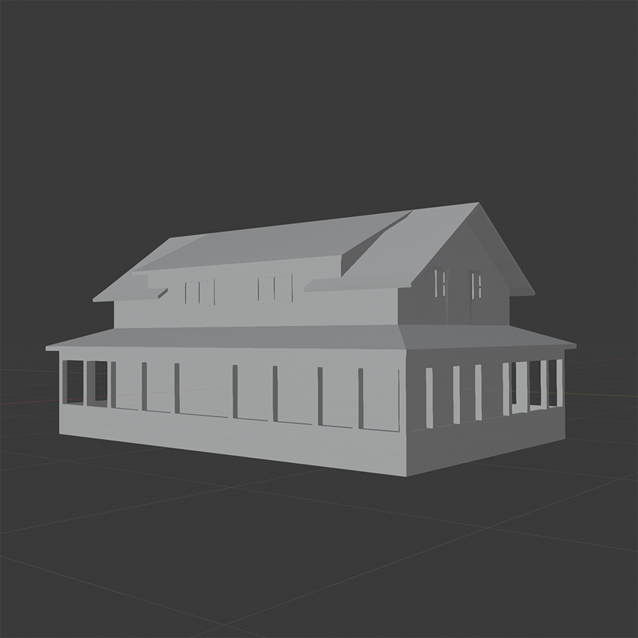
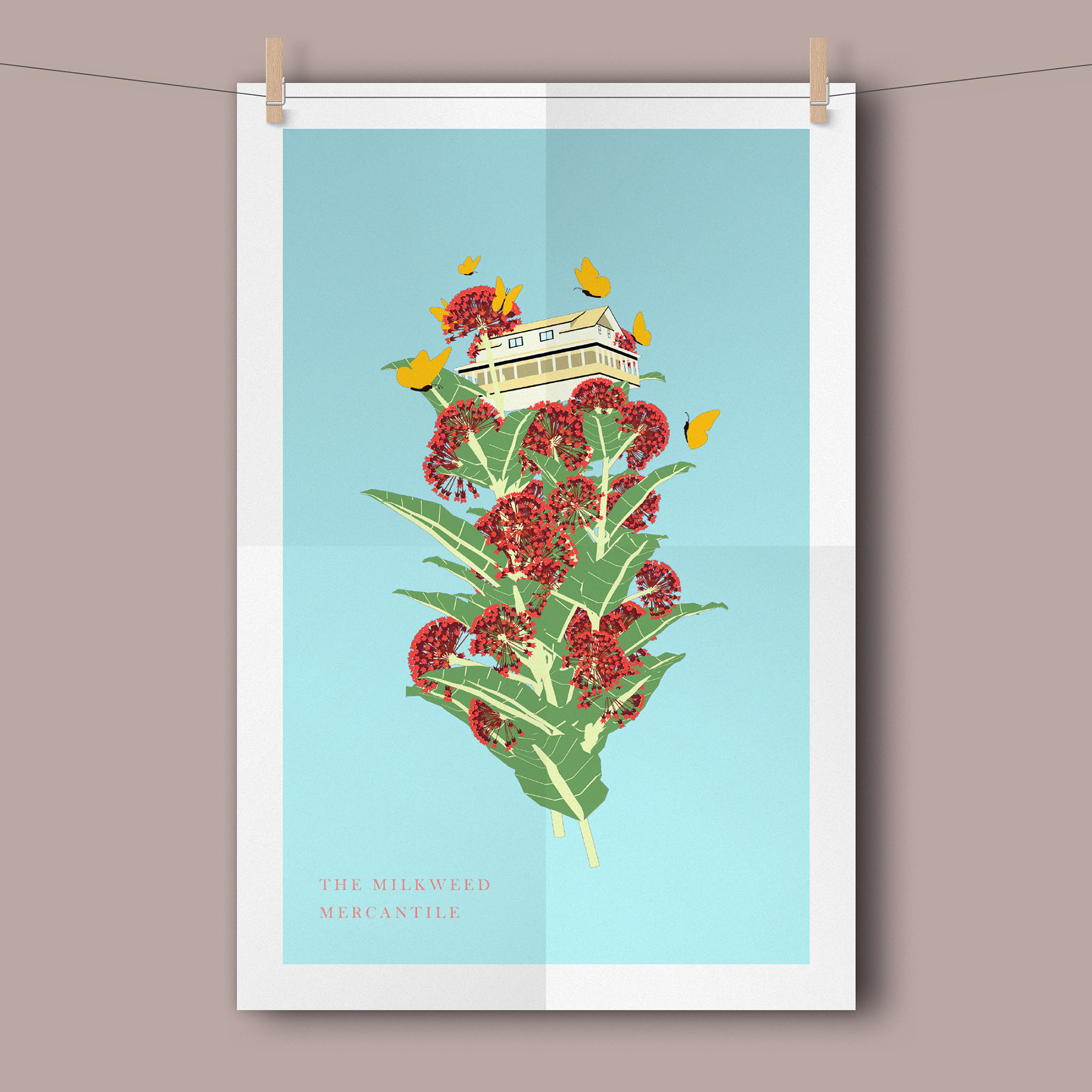
The Milkweed Mercantile is an Eco-friendly B&B and Café. As part of my BFA capstone project, I redesigned the Mercantile’s visual identity and website, as well as 3D graphics and animations for the website.
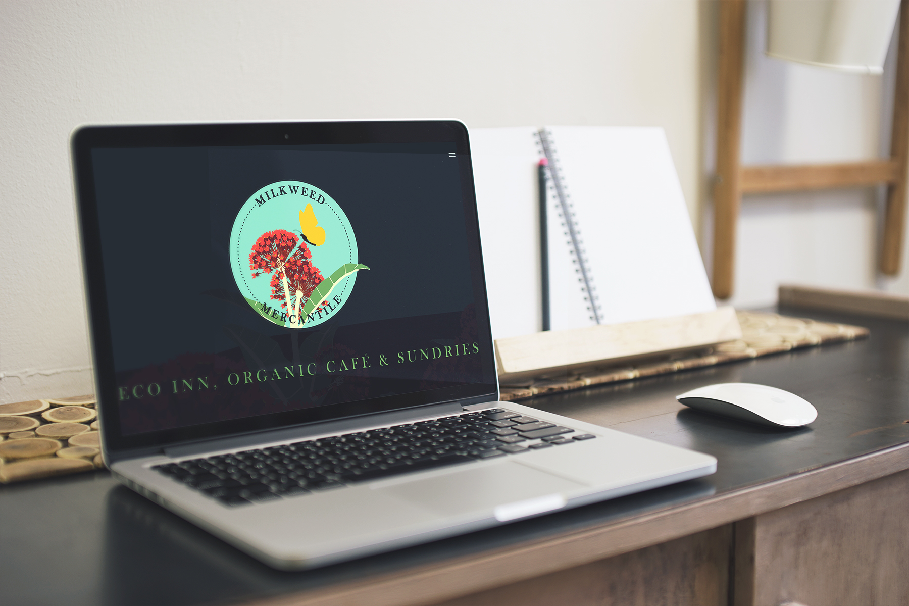
The website is designed to give a scroll-based flyover tour of a 3D representation of the Milkweed Mercantile, progressing smoothly through pages about each of the Mercantile’s aspects. These pages can also be reached quickly through a drop-down menu in the upper right corner if the viewer wishes to jump to a certain piece of information.
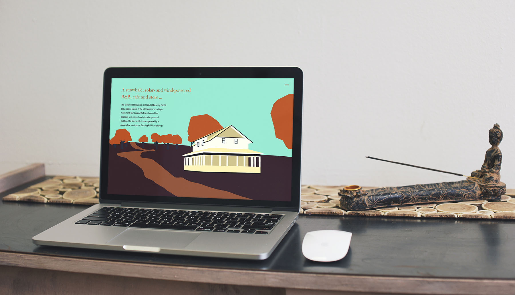
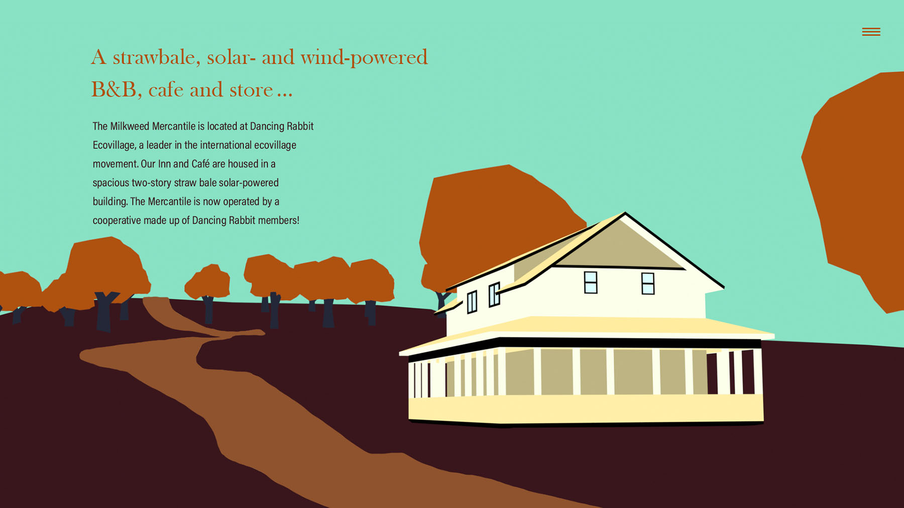
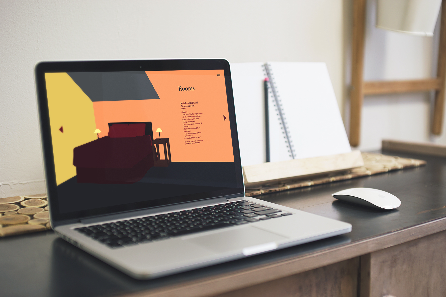
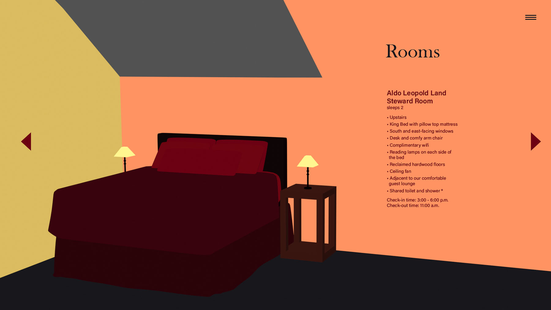
The 3D models I created use simple emission materials that apply flat, unshadowed color to the models and give the graphics an illustrative quality.

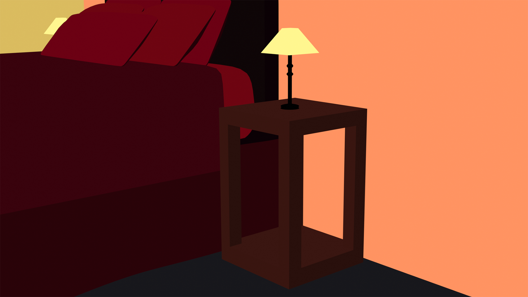
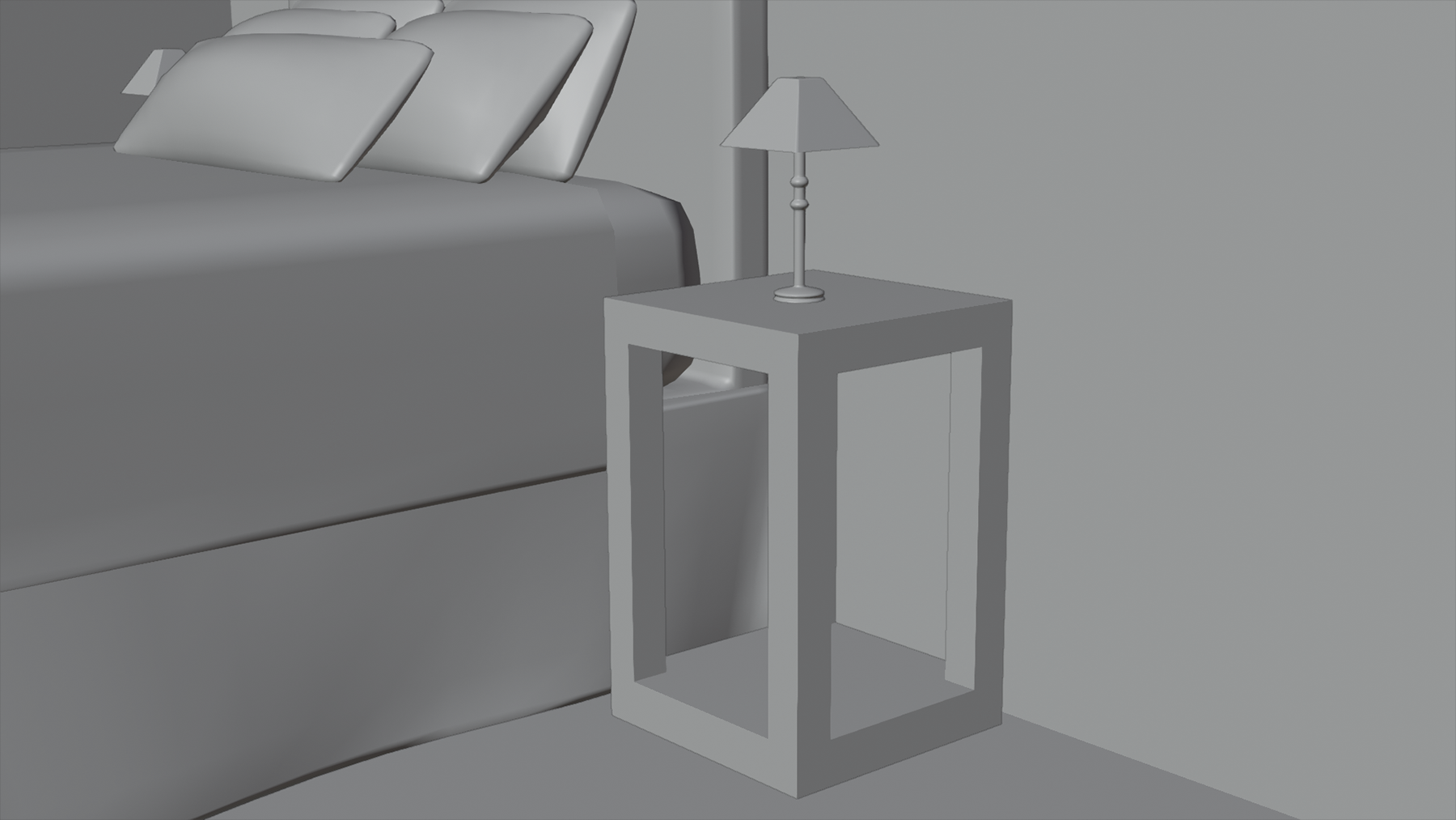
I also designed decorative items to be used around the Milkweed Mercantile itself or as souvenirs for visitors.
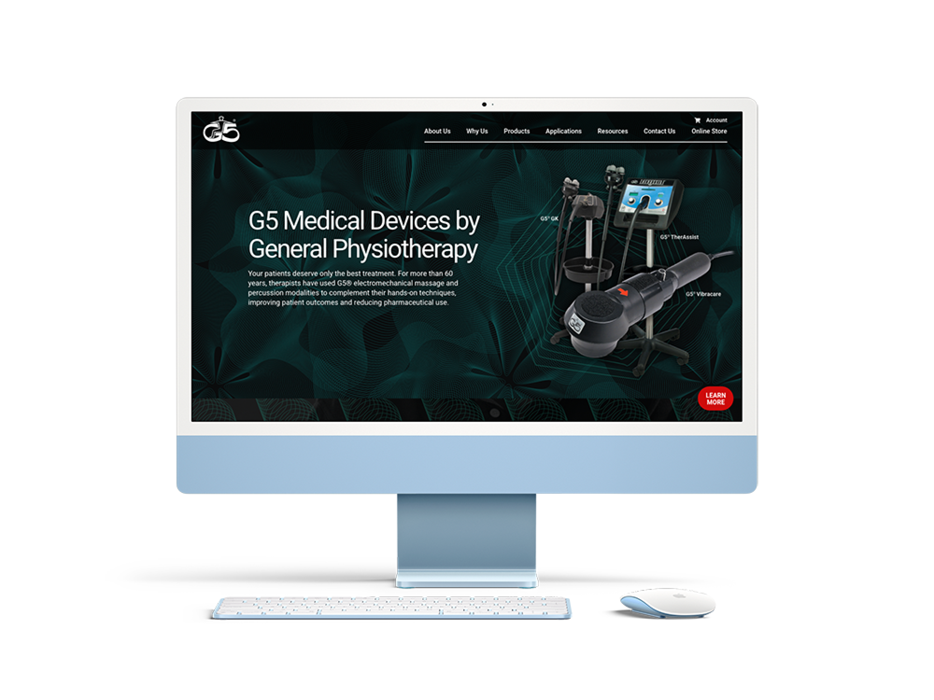
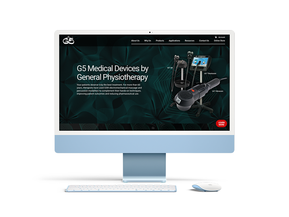
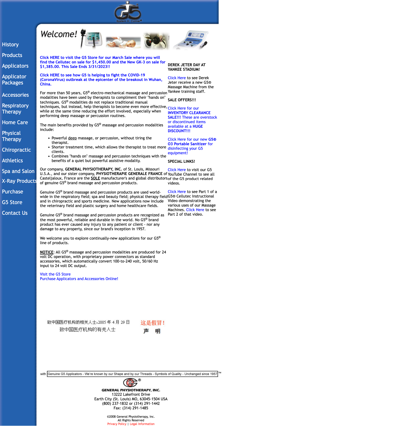
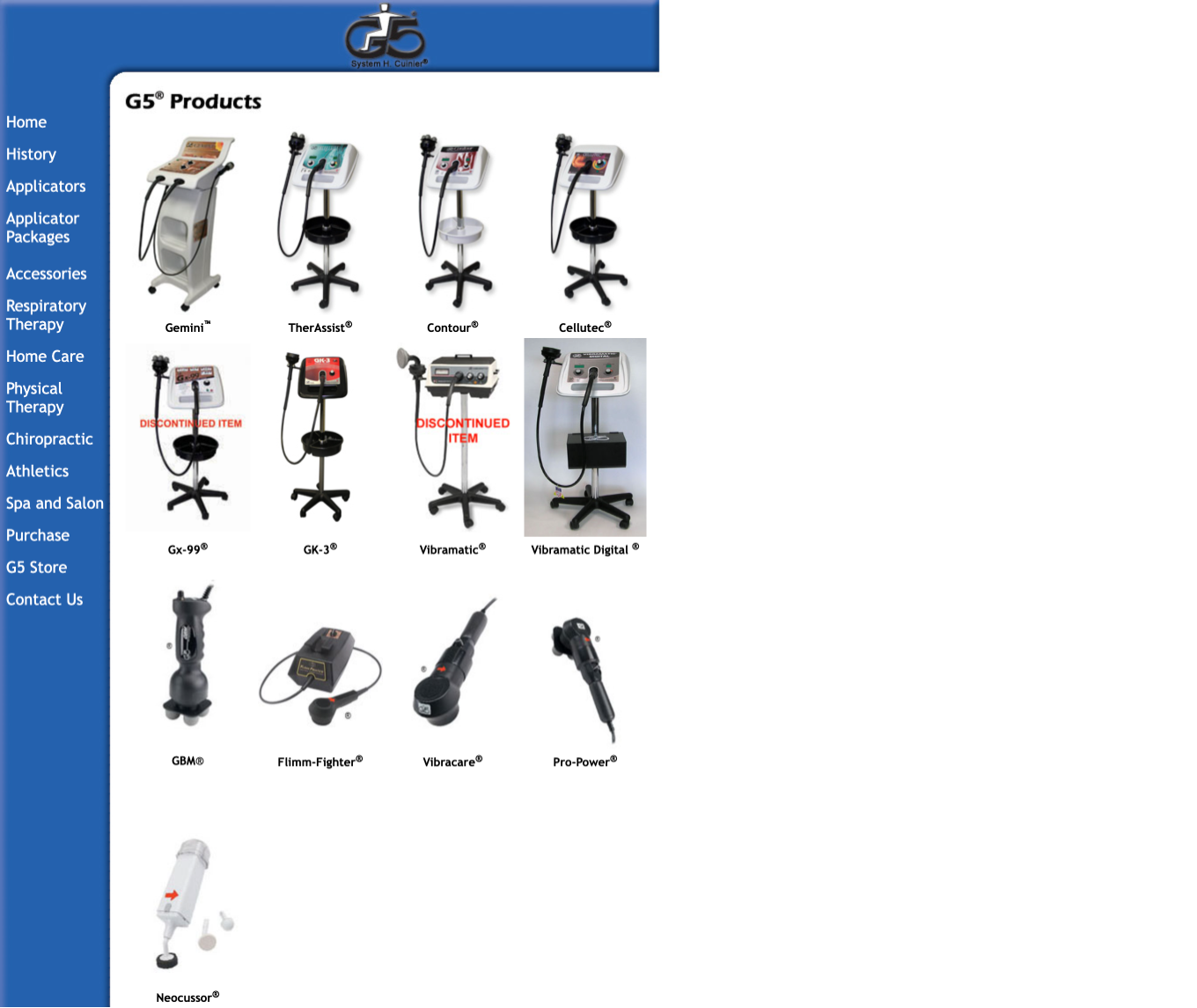
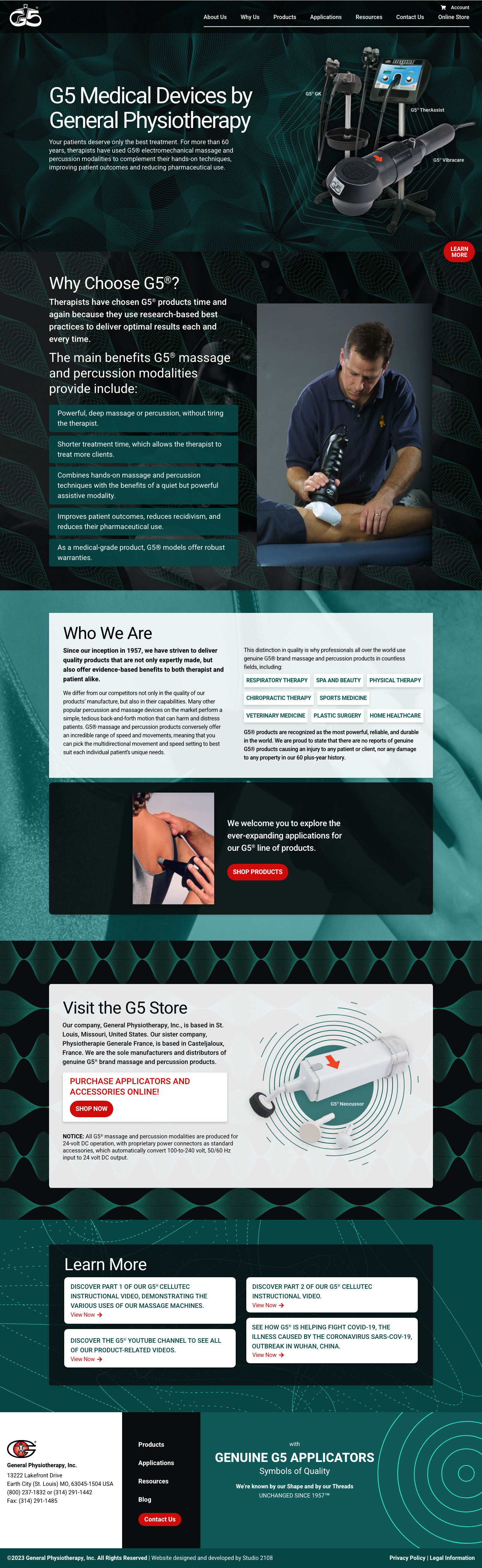
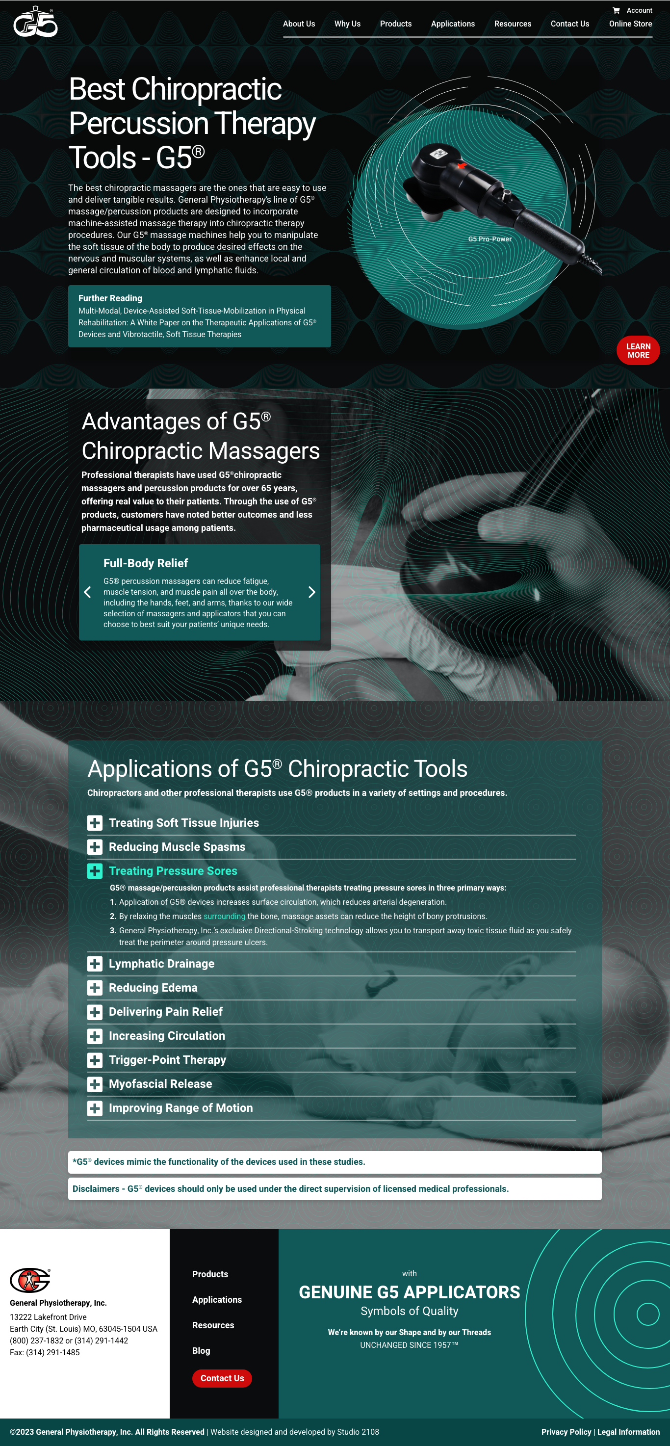
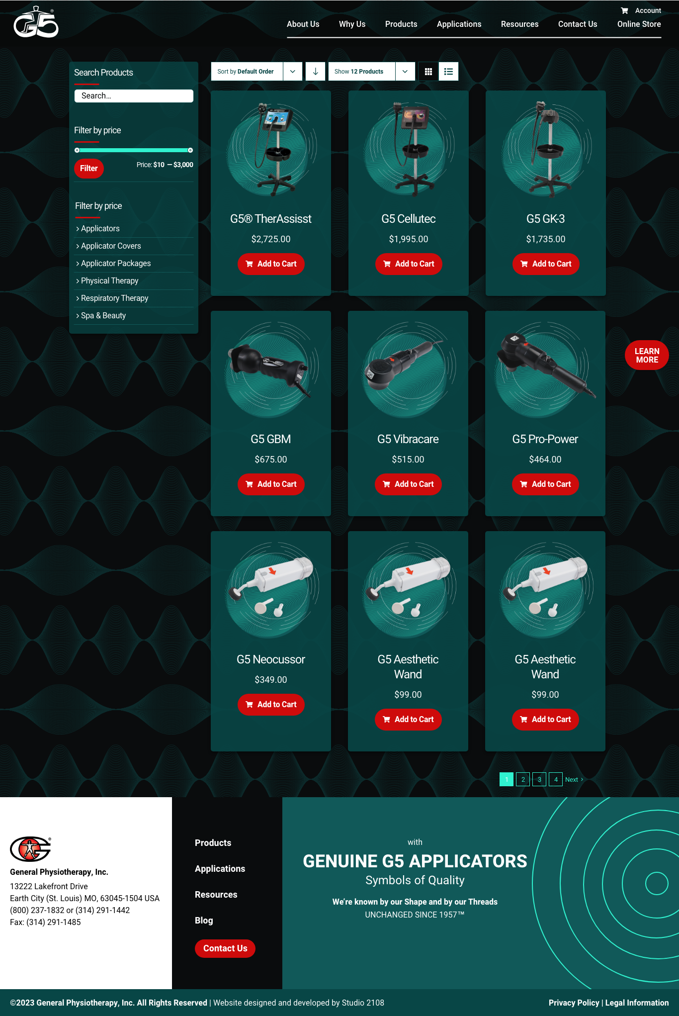
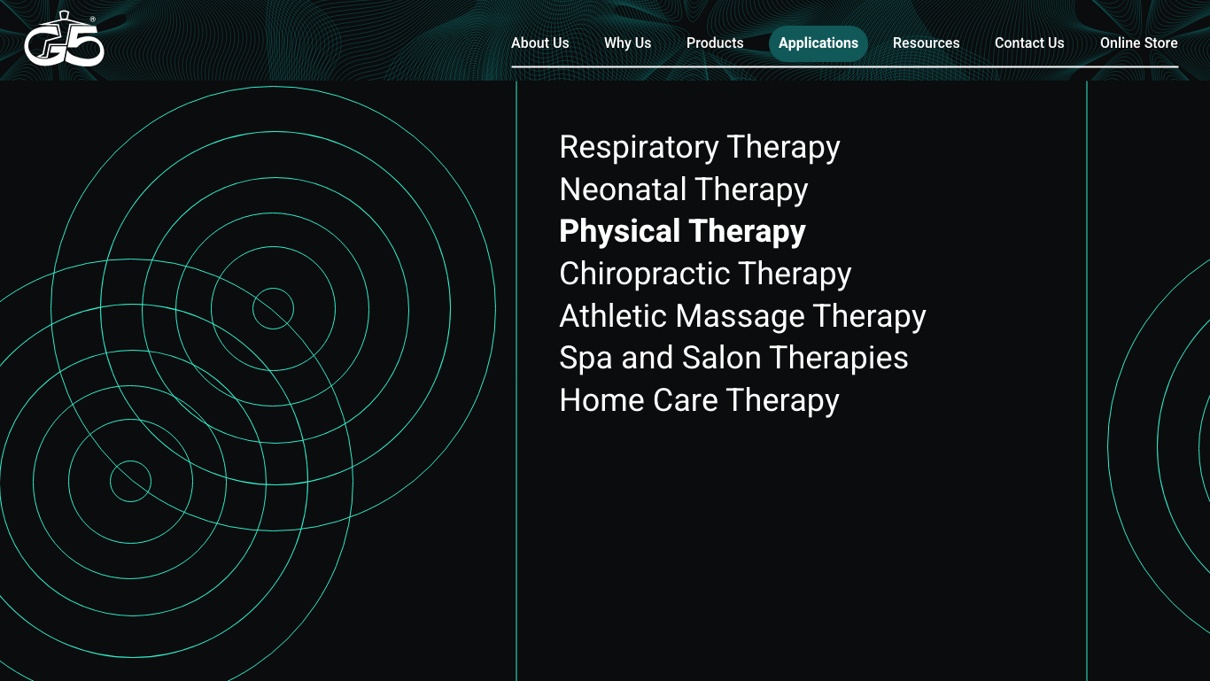
G5 is a medical massage therapy machine producer who has been in the business for more than 50 years and is now a gold standard in the massage therapy industry. Used by professional athletes, physical therapists, and patients, G5 is known as a reliable producer of medical devices. However, G5’s website, which hadn’t been updated in nearly fifteen years when they came to us and was running on outdated web technology that made it difficult for them to edit the site’s content, was not a visual match for their reputation. Additionally, G5 was growing their business and needed to reorient their website from focusing only on B2B sales to being an inviting B2C ecommerce experience as well. The brand needed a lift that would communicate their well-earned place in the world of modern medical technology, while simultaneously representing their identity as a trustworthy, established business, and being inviting enough for the average consumer to feel confident purchasing a machine from the site.
All design and graphics for this site are my work. Photography and logo assets were provided by the client. The site was developed by team members at Studio 2108.
G5 wanted to redesign their website for the first time in nearly 15 years. Their goal was to update the look, make the site easier to use, and appeal to a wider audience including layman clientele so they could access a B2C market in addition to their existing B2B connections. They also wanted to improve their SEO with a new site structure and target optimized content developed by a marketing team we worked with. Visually, G5 wanted their redesigned site to highlight their products, acknowledge their history, and be creative.
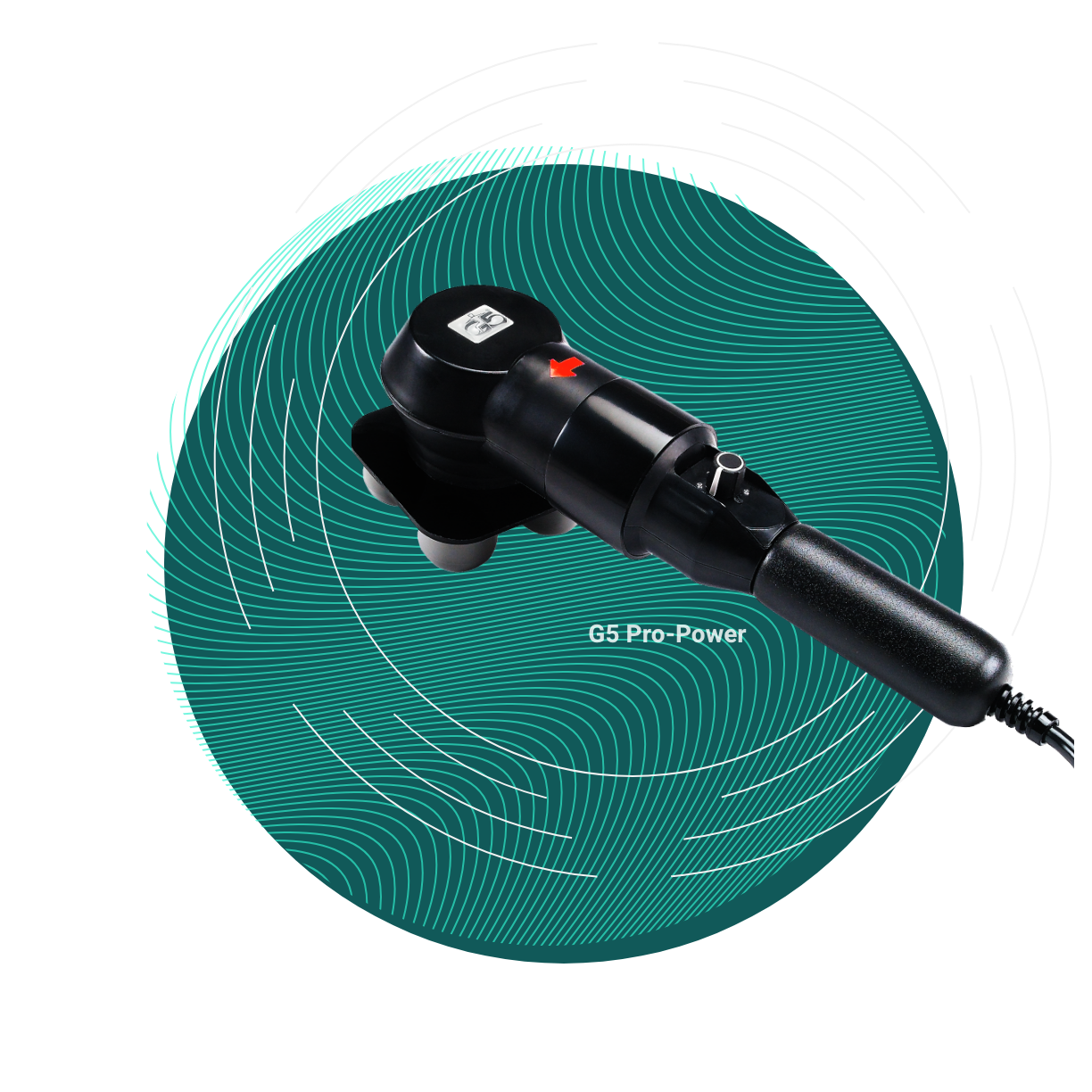
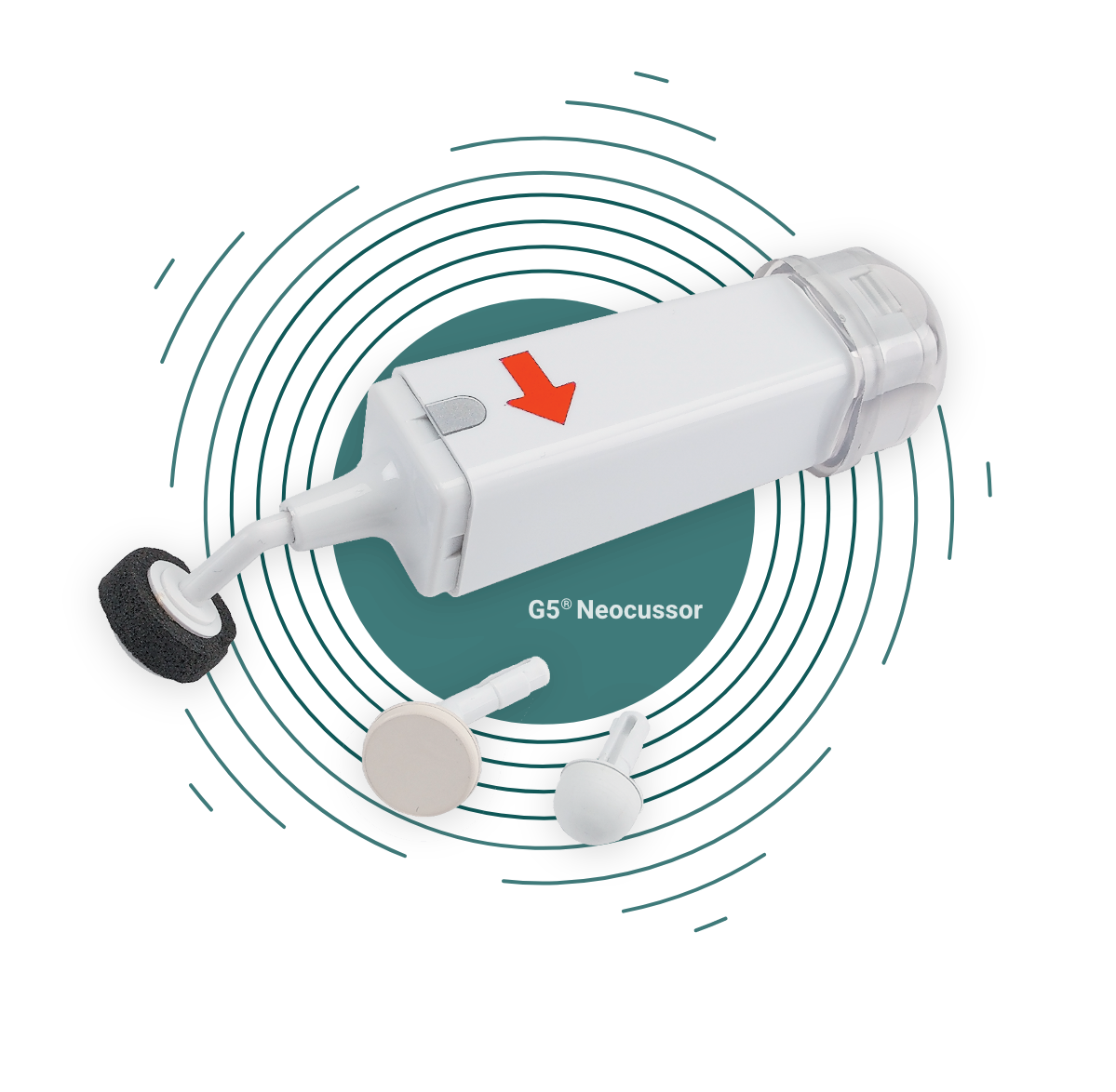
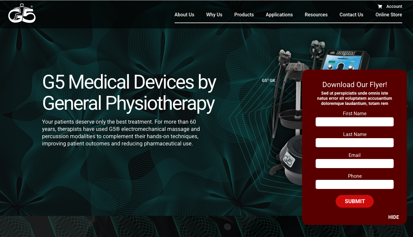
I wanted the site to look modern and futuristic. After a trip to G5 headquarters to test out some of their machines, I created graphics for the site that visually represented some of the massage patterns their machines use. These vibrating patterns are ghosted in glowing green and teal over dark backgrounds. I also spiced up old photography for the site. Since this project was on a short deadline, there was no time to take new photography, so we had to draw from G5’s photography archives. I created eye-catching graphics to draw attention and add excitement to the product imagery. I wanted to employ surprise throughout this site to engage and delight the user. From the graphics, to the mega-menu, to the footer, my goal was for everything in this site to delight the user.
The old G5 site, which hadn’t been redesigned since 2008, had some major problems. The menu was inconsistent page-to-page. The site, rather than having a responsive design, was a static width that was too small for today’s browser sizes and too wide for mobile devices.
My task was to give the site a whole new look and a new, responsive, user-friendly design that would help G5 in their shift toward B2C sales.
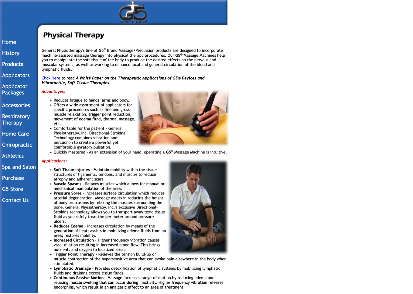

The client needed the new site fast for a showcase that was coming up. There was no time to take new photography, so I spruced up some old photos they provided. The result was decades old photography used in a modern way, simultaneously communicating the company’s age and reliability as well as their relevance in the contemporary technological sphere.
I took care in handling product photography, as G5’s products were the purpose of the site. To bring attention to the devices, I created graphics that draw the eye inward to the product and add interest.
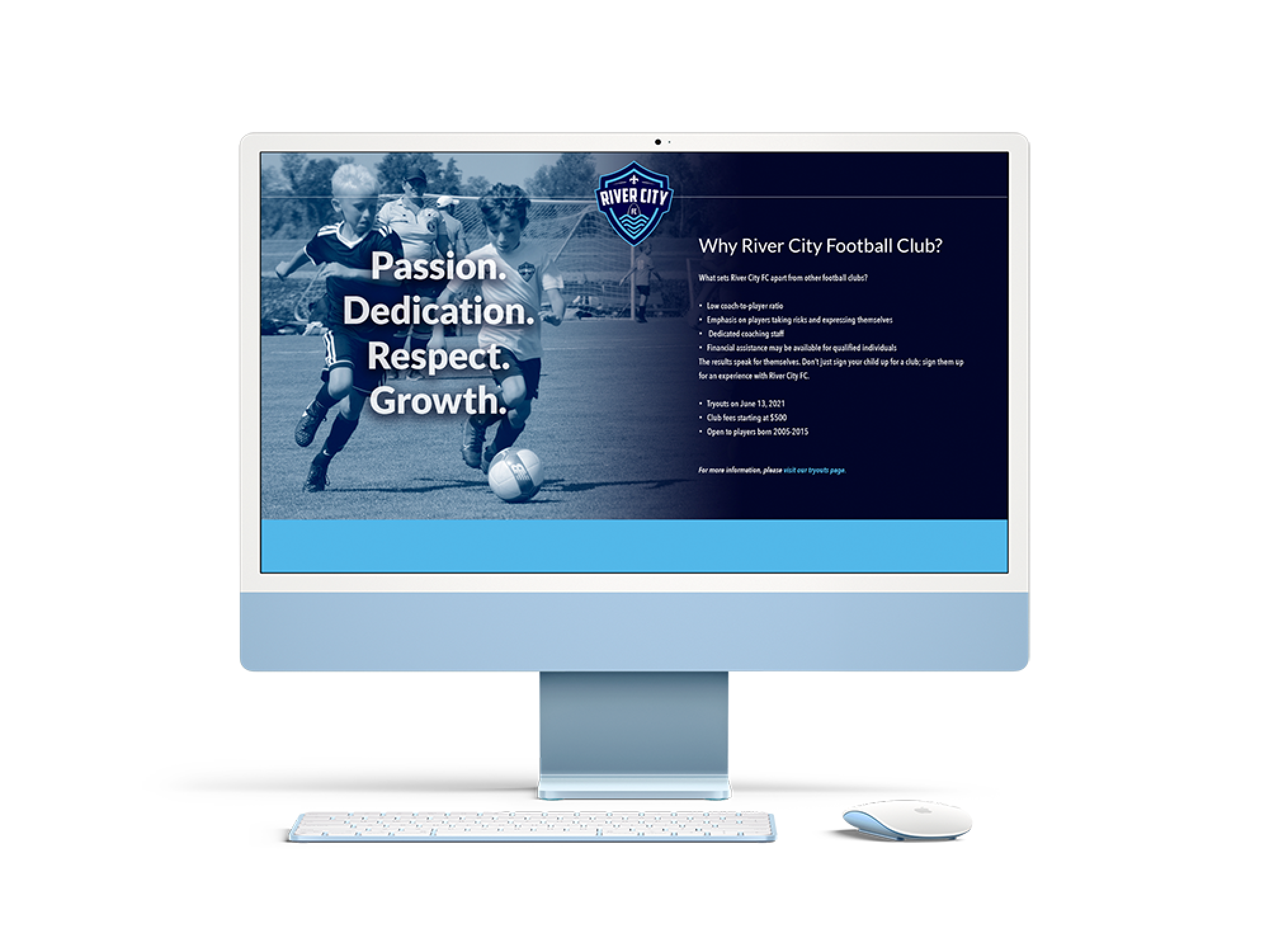
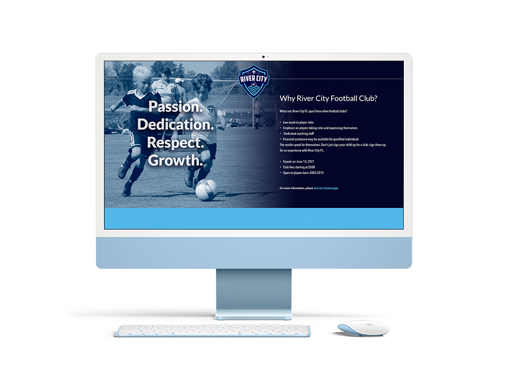
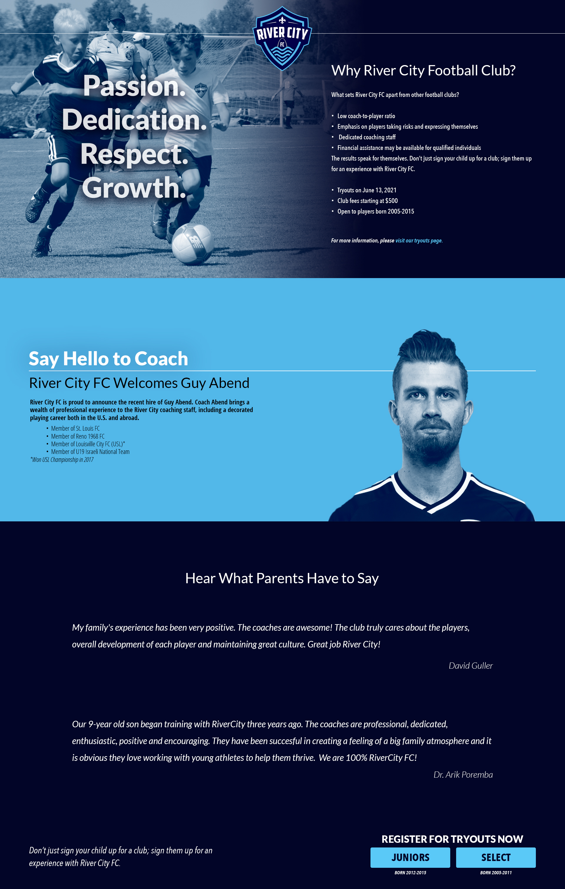
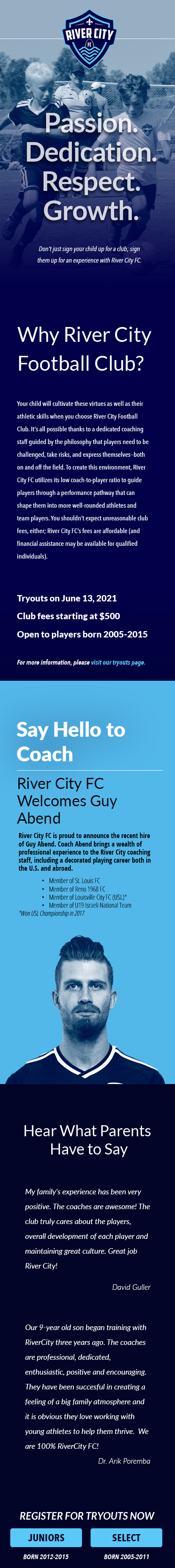
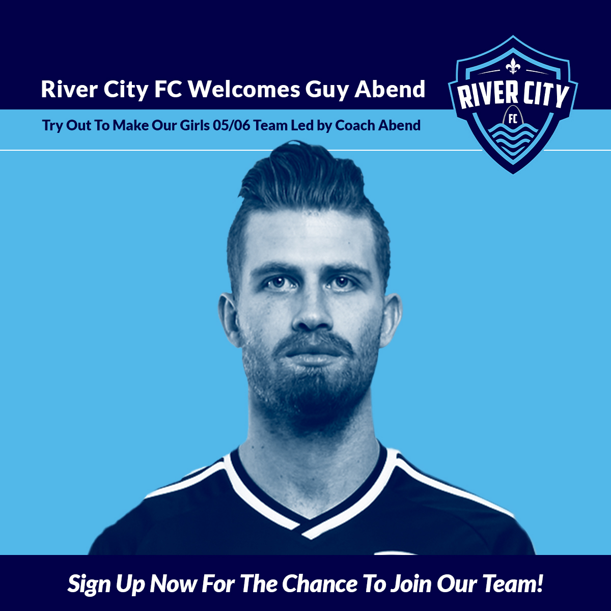
River City Football Club is a premier youth soccer club based in St. Louis, Missouri, a city known for being the hometown of many professional soccer players. River FC helps players reach their full potential by offering a supportive, positive environment for young players to learn and grow.
The purpose of this project was to create a landing page as a destination for a marketing campaign for River City FC’s soccer tryouts. The landing page needed to provide information about River City FC, their teams, and make it easy for parents of players to sign their children up for tryouts.
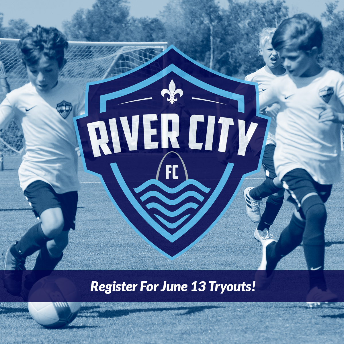
As part of this project, I also design social media posts for the marketing campaign that would point to the landing page. The posts needed to be engaging, and match the landing page in look and feel for continuity between the two experiences.
I designed the landing page to have the impressive look and feel that a premier soccer league deserves, and to be easily navigable for a high conversion rate. The CTA buttons are sticky to the bottom of the browser, so users can easily access it whenever they are ready. For an impressive hero photo, I recolored an image from a River City FC soccer game with a duotone treatment of River City FC’s light blue and dark blue brand colors. I used those same brand colors throughout the page for typography and other design elements. I created the social media ads to have a very similar look and feel, so that users would know they were in the right place when they clicked the link to the landing page.
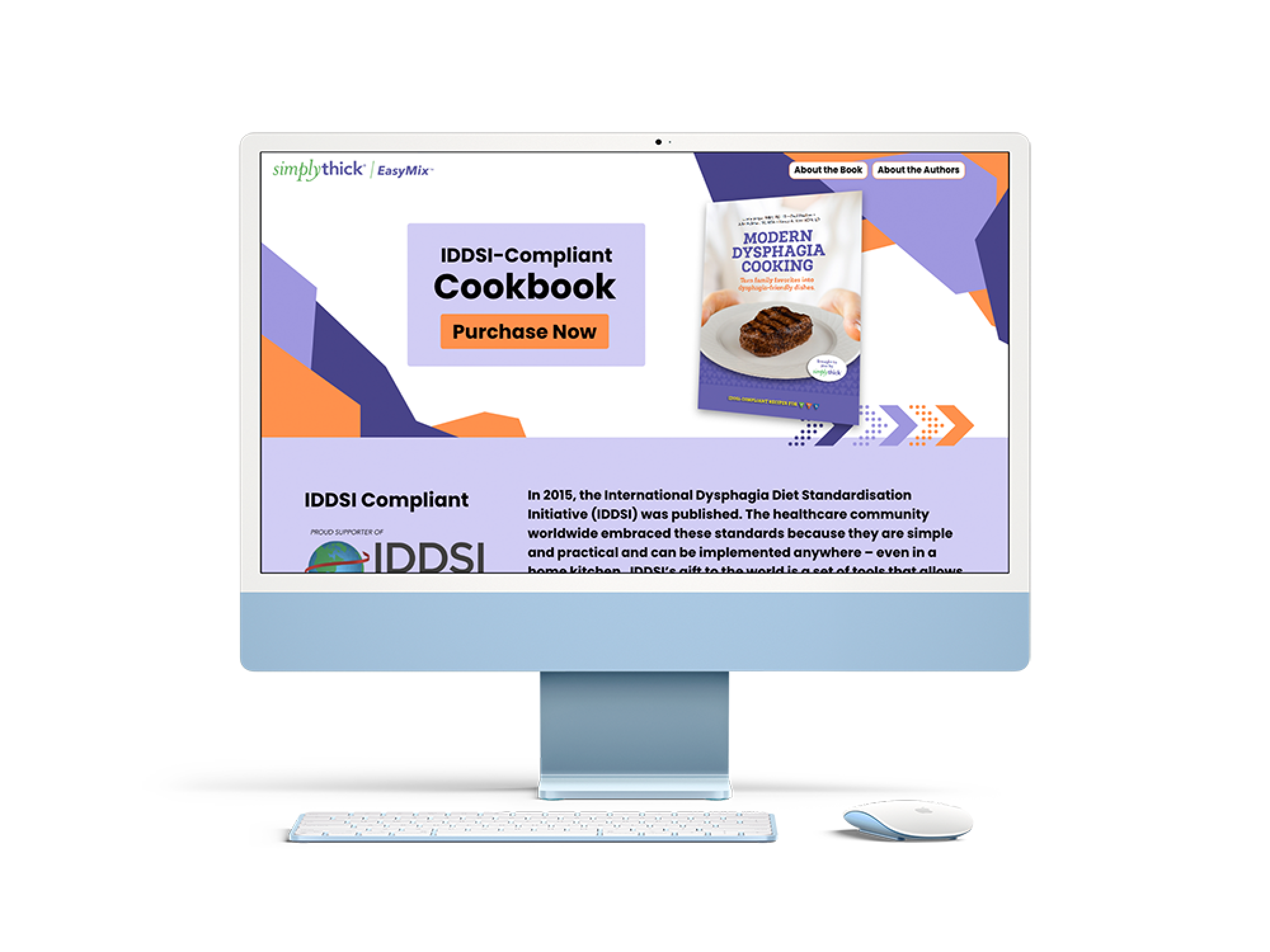
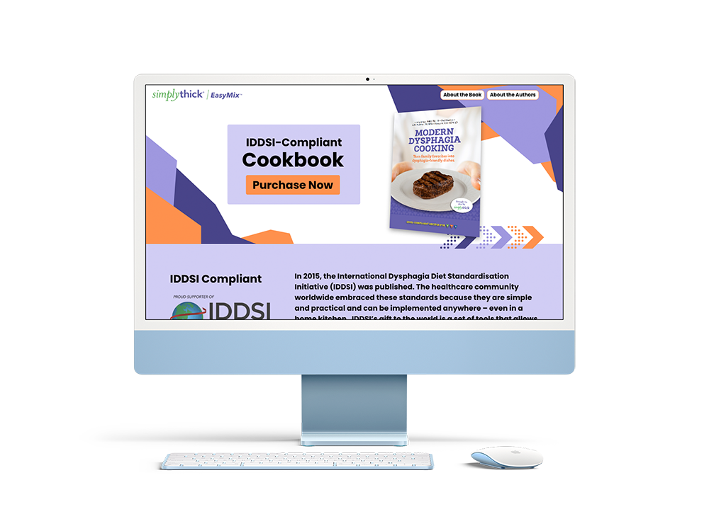
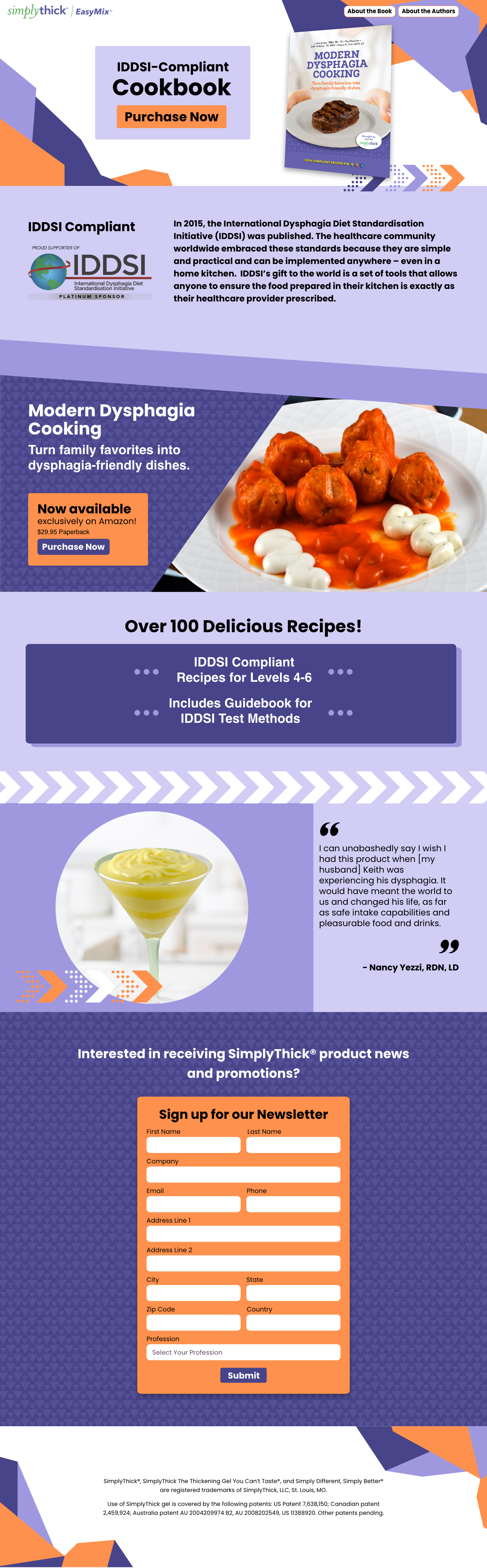
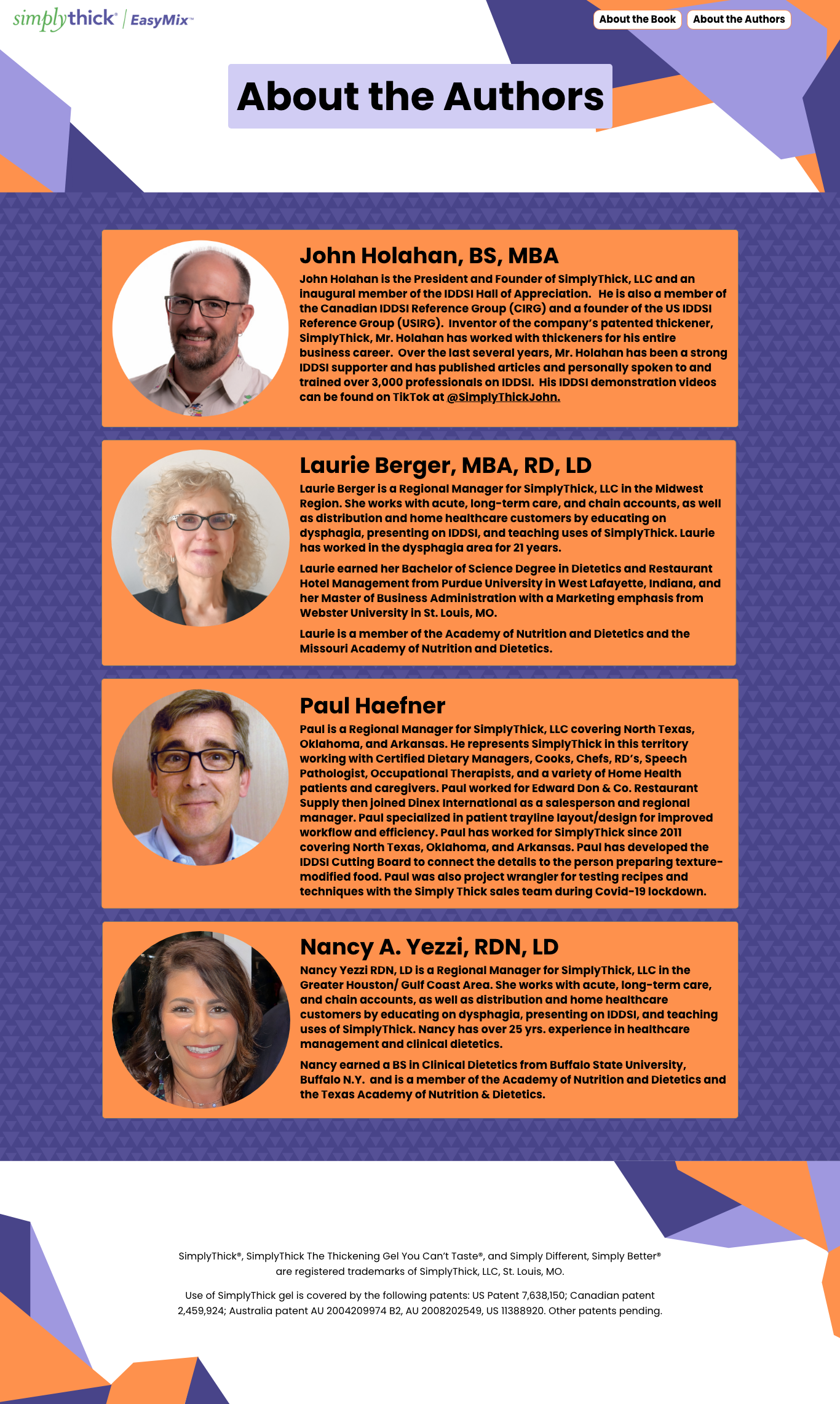
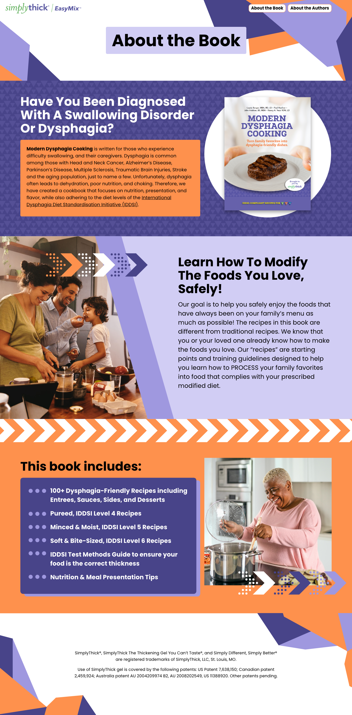
SimplyThick produces a food and beverage thickener for people living with swallowing disorders, also know as dysphagia. Their cookbook, Modern Dysphagia Cooking, includes recipes for use with their thickening products.
The purpose of this project was to create a website for SimplyThick to advertise their new book, Modern Dysphagia Cooking. The site needed to be engaging, give a preview of food from the book’s recipes, show that cooking for dysphagia can be delicious and fun, and ultimately point users to the link to purchase the book. I designed a site that accomplished all these goals while staying consistent with the existing branding for the book.
The graphics on the site reference the graphics in the book itself and other branding surrounding the book. I created header, hero, and footer graphics that use a playful triangular design similar to Simply Thick’s advertisements for the book. The background patterns and playful graphics that decorate the page’s layout also hint back to the book’s design. This, plus SimplyThick’s food photography, employed over a creative angular layout, accomplished SimplyThick’s goals of using the site to convey the message that cooking for dysphagia can be fun and delicious.

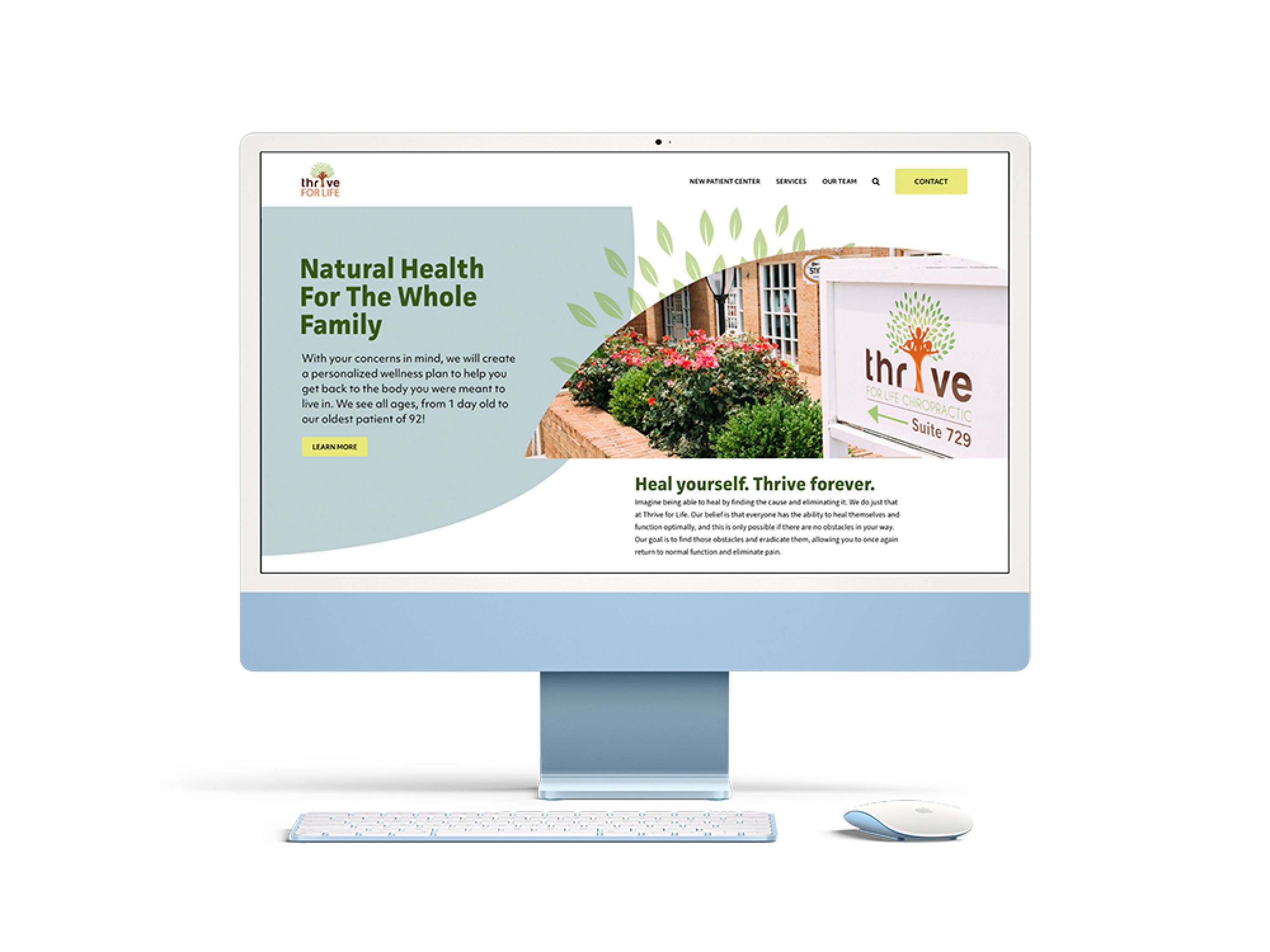
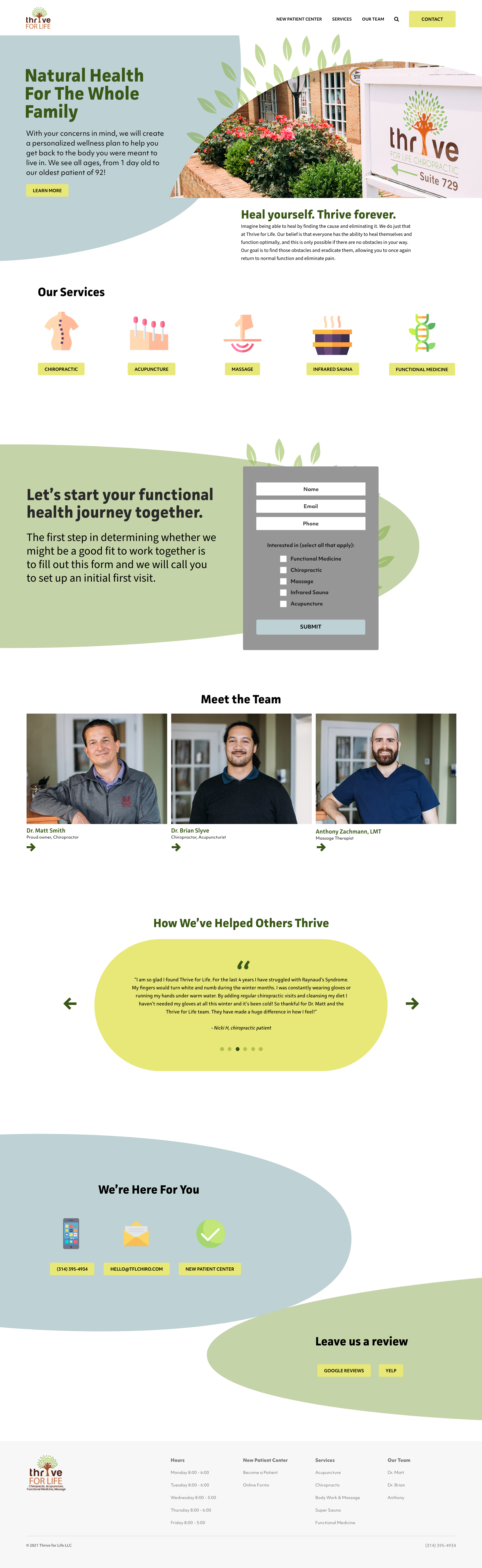
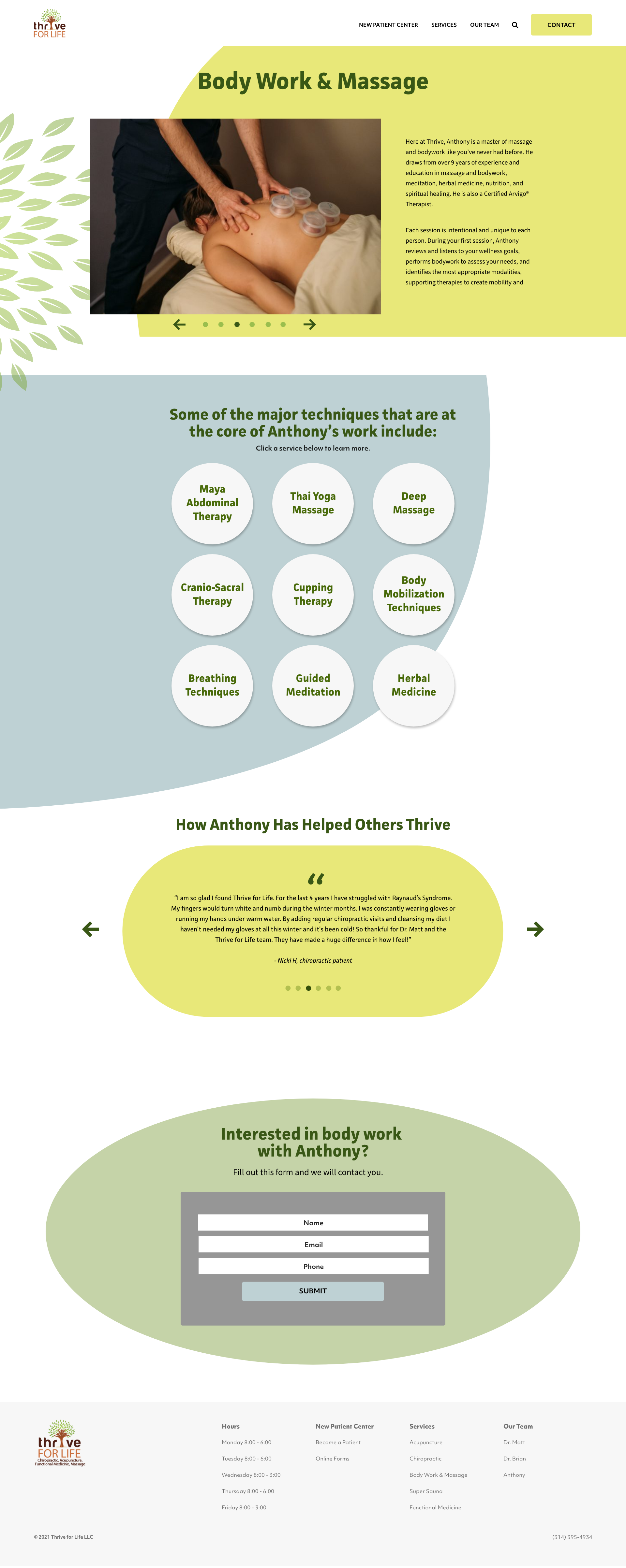
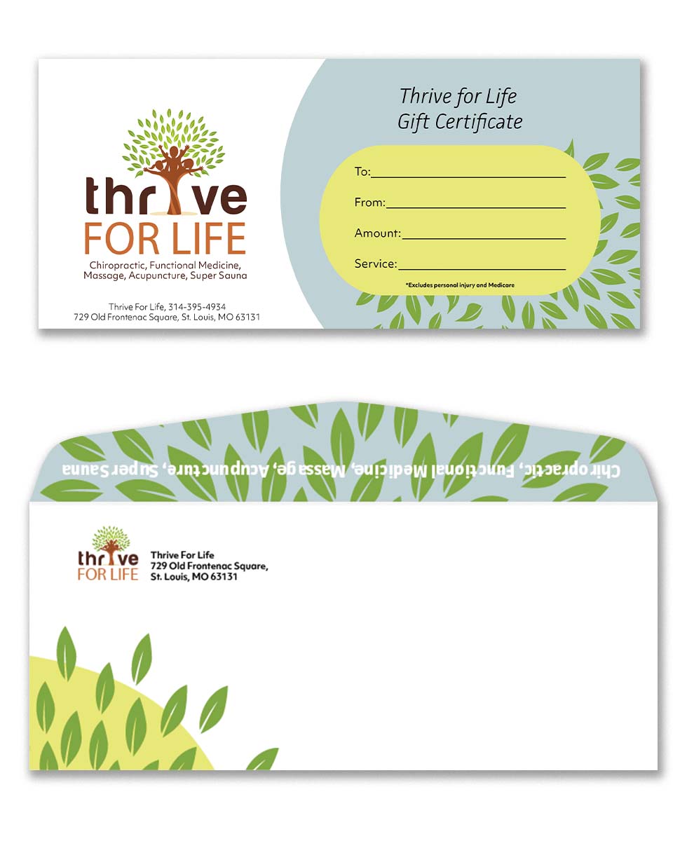
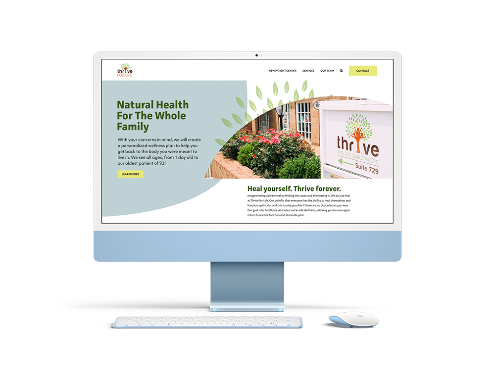
Thrive for Life Chiropractic is a holistic wellness center that provides chiropractic, massage therapy, and acupuncture services to the St. Louis region. To reflect Thrive’s mission to cultivate naturalistic health, I gave their site a redesign that features organic shapes and illustrations, playful colors, and curving structure to naturally guide the eye down the page. I used the same visual language on Thrive’s new print materials.
When Thrive for Life came to us, their site was long overdue for a design refresh, and the visuals throughout the site were outdated and no longer represented Thrive’s identity. The purpose of this website redesign was to update the look, make the site easier and more enjoyable to use, and enhance the user’s experience.
Since Thrive seeks to bring a peaceful and life-enriching experience in their chiropractic practice, my goal for this redesign was to make the website contribute to those goals as well. I designed this site to be fun and organic to use, appeal to the target audience of chiropractic patients, and bring to mind concepts of growth, life, and wellness.
The graphics for the site include bunches of leaves, fun colors, and lots of curves. Thrive wanted bright, playful visuals to allude to the happiness they hope to bring with their services. The leaves hint at the natural aspect of their practice and call back to their logo. The curving background graphics, circles, and rounded corners everywhere, are meant to give the impression of safety, peace, and relaxation.